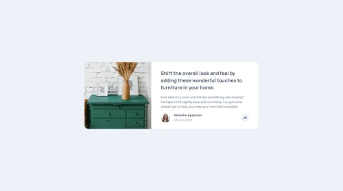
Responsive Article Preview using HTML, CSS and JavaScript

Solution retrospective
Overall I feel very comfortable with the implementation of responsive design and styling in general, and it was great practice to combine this with some basic javascript. Next time, I will do some more research beforehand, to avoid having to change my approach mid-project as I did this time, due to finding the toggle class option in javascript.
What challenges did you encounter, and how did you overcome them?The main challenge for this project was definitely finding a solution for how to handle the changes in design and layout when clicking the share button. Not only should it adapt in terms of screen size and state, but also for resizing of the window, as this could result in a bugged layout. I ended up using the toggle method for the classList property, which allowed me to toggle classes on and off according to specific scenarios.
What specific areas of your project would you like help with?All feedback is welcome, as I'm always looking to learn. Perhaps there is a more efficient way to handle the toggling?
Please log in to post a comment
Log in with GitHubCommunity feedback
No feedback yet. Be the first to give feedback on Petter Torst Saatvedt's solution.
Join our Discord community
Join thousands of Frontend Mentor community members taking the challenges, sharing resources, helping each other, and chatting about all things front-end!
Join our Discord