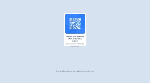
Skip to content
  • Unlock Pro
  • Log in with GitHub
Solution
Submitted 11 months ago

Responsive barcode page using css media query and grid to solve it all

Ayobami2411•20
@Ayobami2411
A solution to the QR code component challenge
View live sitePreview (opens in new tab)View codeCode (opens in new tab)

Solution retrospective


What are you most proud of, and what would you do differently next time?

I am glad I was able to figure this project out, and create something stunning

What challenges did you encounter, and how did you overcome them?

I didn't know how to align the items to the center and also I don't know how to make the item bigger than it is right now

What specific areas of your project would you like help with?

making the images bigger so that there will be no need for zooming in at 100%

Code
Couldn’t fetch repository

Please log in to post a comment

Log in with GitHub

Community feedback

  • P
    Daniel 🛸•44,740
    @danielmrz-dev
    Posted 11 months ago

    Hello there!

    Congrats on completing the challenge! ✅

    Your solution looks great!

    I have a suggestion:

    • Since you set grid to the body, but you didn't set the size of the rows, your footer is pushing your card up a little bit. You can prevent that from happening adding this to the body:
    grid-template-rows: 90% 1fr;
    

    Then your card will always occupy 90% of the space and the footer will adapt in the remaining space.

    I hope it helps!

    Other than that, you did an excellent job!

    Marked as helpful
  • Grace•32,130
    @grace-snow
    Posted 11 months ago

    Hi, sorry for the delay! I've just got back from some time off and remembered I promised to give feedback on this to help you lay some better foundations.

    I'm afraid this has some substantial problems. I'll list them out one by one and hopefully it will help you refactor this and take the learnings over into other projects.

    1. All content should be contained within landmarks. This needs main landmark with the card component inside and a footer landmark for the attribution.
    2. The image does not need rapping in an extra div. Try to keep the HTML as simple as possible.
    3. The image is extremely important content. Therefore it needs a proper alt description. Remember alt is not code it is content. It must be a human readable description of that image. In this case needs to say what the image is (QR code) and where it goes to (to FrontendMentor.io).
    4. The paragraph must be a paragraph not heading. Choosing appropriate HTML elements for the content is an essential skill that you must master.
    5. Get into the habit of always including a full modern CSS reset at the start of the styles in every project. Andy Bell or Josh Comeau both have good examples you can look up and use. This will do important things like remove margin from the body and make images display block and max width 100%, as well as lots of other useful things. You always need a reset at the start.
    6. There is no reason at all for this card component to be displayed grid. The block elements within it will all stack vertically by default, so unless you're planning to use the gap property to create space between the card's child elements, there is no benefit to use grid or flex in this case.
    7. Make sure you understand the difference between padding and margin. The card should have padding to create space inside it and stop it's children from hitting its edges. The child elements within that card should have vertical margins only to create space between them. See https://fedmentor.dev/posts/padding-margin/. Stop setting weird margins on on the left or top of different elements you don't need to do this.
    8. Remove all heights and widths from this. You don't need any of them. Instead use a single max-width in rem on the card. That tells it to grow only up until a certain width and no wider, and also tells it it can shrink narrower when it needs to such as on small screens. There is no need at all for a height. Let the browser do its job and decide what height is needed based off the content within the component and the spacings within.
    9. Never limit the height of any elements that contain text, including the body. This solution currently breaks because you have set the body height to be 100vh. Instead, change this to min-height. That says "I always want this to be at least 100vh (or svh) tall, but it can grow beyond the viewport height if needed." For example Think of how small 100 VH is when viewed on a small mobile phone in landscape orientation. The body would need to grow taller than that. It's the same principle on the card it doesn't need a height and giving it a height will break it for people who have their text set to be a larger default size.
    10. Speaking of text size, you must never use pixels for font size. Instead use rem. This will respond to the users chosen text size. Everything in your solution at the moment is way too small. I can't even read the text it's so small. The style guide states what font size should be used for the body, it just needs to be converted to rem before use in CSS. That is the size that your paragraph should be.
    11. The image doesn't need a width or height. All it needs is what's already included in the CSS reset which is max-width 100%. You can make it width 100% if you wish. The image shouldn't need any margins because it is full width of the card anyway. Remember the space from the edges of the card is created by padding on the card.
    12. I recommend against using Display grid place content centre on the body. This can cause overflow bugs for people who have a larger tech size and view on a smaller screen. Instead I recommend making the body a flex column. Then if you wish to push the footer down to the bottom of the screen you would simply place flex-grow: 1; on the main landmark.
    13. To make sure the component can never touch the screen edges either give the card component a little margin on all sides; or give a wrapping element (like the body) a little padding on all sides.
    14. As all the text in the card is centred you can place text-align center on the component itself instead of on individual child elements. They will inherit the text alignment from their parent.
    15. I noticed there are several places where you are adding flex properties to non-flex elements which means the CSS declarations do nothing but bloat your CSS. Try and remove everything which is not needed.
    16. I'm not sure that you mean to use rem for border radius... It's not "wrong" but it is unusual. Only use rem when you want a property to specifically scale with the users chosen font size. So rem makes a lot of sense for max-width on a component or for font-size declarations but may not be what you want for border width or radius. I expect the image border radius will need to be slightly different than that of the card itself.
    17. Do not remove underlines from links. In your attribution there are links that don't look clickable -- this is an accessibility failure. Keep the text decoration and preferably a different colour and a hover style. Also make sure you update the href for your own link. Currently it goes nowhere, but should go to your GitHub or Frontend mentor profile.
    18. Check you've linked the font-family correctly. I can't see the actual font link in there, only the google font preconnect links.
    19. Move your CSS into a separate linked CSS file.

Join our Discord community

Join thousands of Frontend Mentor community members taking the challenges, sharing resources, helping each other, and chatting about all things front-end!

Join our Discord
Frontend Mentor logo

Stay up to datewith new challenges, featured solutions, selected articles, and our latest news

Frontend Mentor

  • Unlock Pro
  • Contact us
  • FAQs
  • Become a partner

Explore

  • Learning paths
  • Challenges
  • Solutions
  • Articles

Community

  • Discord
  • Guidelines

For companies

  • Hire developers
  • Train developers
© Frontend Mentor 2019 - 2025
  • Terms
  • Cookie Policy
  • Privacy Policy
  • License

Oops! 😬

You need to be logged in before you can do that.

Log in with GitHub

Oops! 😬

You need to be logged in before you can do that.

Log in with GitHub

How does the accessibility report work?

When a solution is submitted, we use axe-core to run an automated audit of your code.

This picks out common accessibility issues like not using semantic HTML and not having proper heading hierarchies, among others.

This automated audit is fairly surface level, so we encourage to you review the project and code in more detail with accessibility best practices in mind.

How does the CSS report work?

When a solution is submitted, we use stylelint to run an automated check on the CSS code.

We've added some of our own linting rules based on recommended best practices. These rules are prefixed with frontend-mentor/ which you'll see at the top of each issue in the report.

The report will audit 1st-party linked stylesheets, and styles within <style> tags.

How does the HTML validation report work?

When a solution is submitted, we use html-validate to run an automated check on the HTML code.

The report picks out common HTML issues such as not using headings within section elements and incorrect nesting of elements, among others.

Note that the report can pick up “invalid” attributes, which some frameworks automatically add to the HTML. These attributes are crucial for how the frameworks function, although they’re technically not valid HTML. As such, some projects can show up with many HTML validation errors, which are benign and are a necessary part of the framework.

Oops! 😬

You need to be logged in before you can do that.

Log in with GitHub

Frontend Mentor for Teams

Frontend Mentor for Teams helps companies and schools onboard and train developers through project-based learning. Our industry-standard projects give developers hands-on experience tackling real coding problems, helping them master their craft.

If you work in a company or are a student in a coding school, feel free to share Frontend Mentor for Teams with your manager or instructor, as they may use it to help with your coding education.

Learn more

Oops! 😬

You need to be logged in before you can do that.

Log in with GitHub