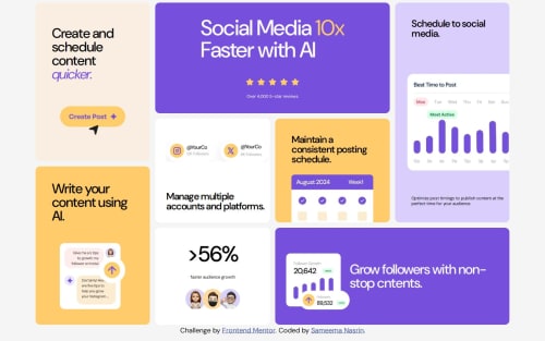
Responsive Bento Grid using CSS Grid and Flexbox

Solution retrospective
I'm most proud of implementing a responsive layout that adapts seamlessly across different screen sizes using a combination of CSS Grid and Flexbox. I also integrated GSAP animations to bring the grid items to life, with a subtle popping effect as they appear at different times on the screen. This added a layer of interactivity and polish to the user experience.
Next time, I would explore additional hover effects or animation variations to further enhance the overall interactivity and make the layout even more engaging.
What challenges did you encounter, and how did you overcome them?One of the main challenges I faced was arranging the grid items dynamically to fit both desktop and mobile layouts as per the design specifications. To overcome this, I utilized CSS Grid's grid-template-areas for desktop and adjusted them using media queries for mobile screens. Experimenting with the placement of items allowed me to achieve the desired outcome.
What specific areas of your project would you like help with?The efficiency of my CSS Grid and Flexbox implementation — are there ways to optimize it further?
Please log in to post a comment
Log in with GitHubCommunity feedback
No feedback yet. Be the first to give feedback on Sameema Nasrin’s solution.
Join our Discord community
Join thousands of Frontend Mentor community members taking the challenges, sharing resources, helping each other, and chatting about all things front-end!
Join our Discord