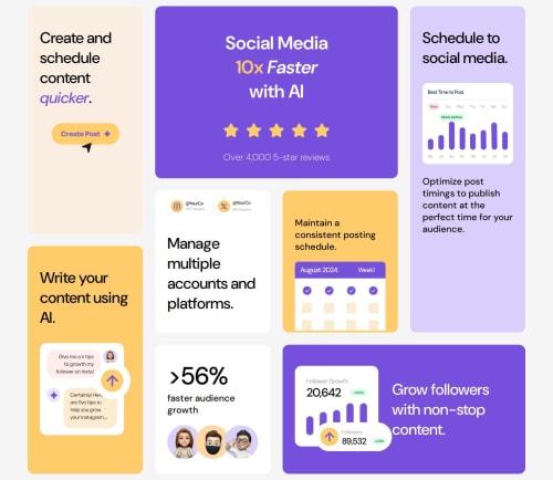
Responsive Bento grid using css grid made both for desktop and mobile

Solution retrospective
during my time working on this project i had the chance to practice in more practical situations. like deciding the size of the grid and being creative while the size is not straight forward which forced me to examine the easiest and most relevant way of setting the size of the grid.
What challenges did you encounter, and how did you overcome them?when i first started i was confused about if i needed to set both column and row sizes or not. when i set both the problem started to be more complicated sooner into the project. But after a few struggles i started again by making things simpler setting the columns first and continuing to the rest according the needs i see. that made the project more enjoyable.
What specific areas of your project would you like help with?for anyone who has the chance to check on my code it would help me if you can give any sort of feedback on how to improve my approach. thank you in advance
Please log in to post a comment
Log in with GitHubCommunity feedback
No feedback yet. Be the first to give feedback on Tesfayeaweke's solution.
Join our Discord community
Join thousands of Frontend Mentor community members taking the challenges, sharing resources, helping each other, and chatting about all things front-end!
Join our Discord