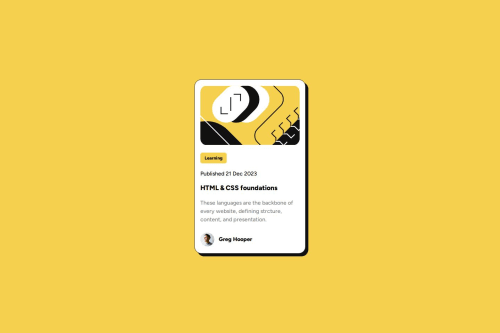
Responsive blog card preview with flex

Solution retrospective
The creation was made straightforward after resetting the complete layout of the project using:
margin: 0;
padding: 0;
box-sizing: border-box;
I'd start with this preset in the next project in order to control better the dimension of any visualization
What challenges did you encounter, and how did you overcome them?When the position of each element within the card weren't completely symmetric among them, however; after using display: flex the arrangement of the elements inside of the containers were easier to measure, and arrange.
What specific areas of your project would you like help with?I'd like to have a better approach about how to implement SVG in future projects and how would it be straight and easy to stylize them.
Please log in to post a comment
Log in with GitHubCommunity feedback
- @vincentwilliamrodriguez
Hello Jhon! Your solution looks neat and organized, especially with the use of BEM. It matches very well with the original design. As for the index.html file, you seem to have used the
<svg>tag for displaying illustration-article.svg. This tag can be helpful if you want to customize the svg directly from the editor, but you may also want to use the<img>tag instead for simplicity purposes, like this:<img src="assets/images/illustration-article.svg">Other than that, great job!
Marked as helpful

Join our Discord community
Join thousands of Frontend Mentor community members taking the challenges, sharing resources, helping each other, and chatting about all things front-end!
Join our Discord