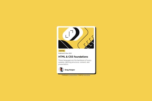
Responsive Blog-Card using CSS Flex

Solution retrospective
im proud of using. flexbox
What challenges did you encounter, and how did you overcome them?few challenges with the responsiveness
What specific areas of your project would you like help with?Feedback is welcome!
Please log in to post a comment
Log in with GitHubCommunity feedback
- P@xayrax88
Nice job on getting the design as close to the source material as possible. I believe you could have used border-radius to round off the edges of the learning block a little bit. I would also suggest to space the elements to "push" down on each other for example having the main blog image use spacing padding-bottom for each element to have that nice spacing to get it as close to source material as possible for spacing. Probably maybe use made it mobile responsiveness for better accessibility. Your code seems well structured, readable and reusable. Your design doesn't differ too much so good job overall though!
Marked as helpful

Join our Discord community
Join thousands of Frontend Mentor community members taking the challenges, sharing resources, helping each other, and chatting about all things front-end!
Join our Discord