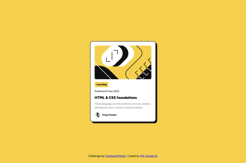
Submitted over 1 year agoA solution to the Blog preview card challenge
Responsive blog card using css grid.

@MohammadAzmatAli
Solution retrospective
What are you most proud of, and what would you do differently next time?
I am very proud that i learnt some new ways to make my pages more responsive for different screen sizes.
What challenges did you encounter, and how did you overcome them?The challenge was to make the page responsive and consistent across all screen sizes. With the help of rem and css grid properties i have achieved that.
What specific areas of your project would you like help with?Open for your suggestions...
Code
Loading...
Please log in to post a comment
Log in with GitHubCommunity feedback
- @mhykah-webdev
Looking good! Maybe look into centering the card vertically.

Join our Discord community
Join thousands of Frontend Mentor community members taking the challenges, sharing resources, helping each other, and chatting about all things front-end!
Join our Discord