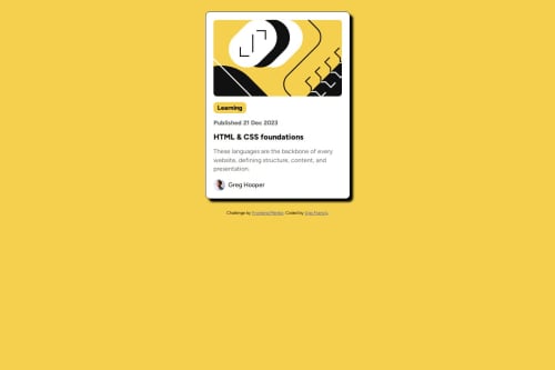
Submitted 10 months agoA solution to the Blog preview card challenge
Responsive blog card using flexbox

@Vanfrankie7
Solution retrospective
What are you most proud of, and what would you do differently next time?
I am proud to have completed this challenge
What challenges did you encounter, and how did you overcome them?I had the challenge of the overfloating svg file when i was making the container responsive to mobile screens. I added width: 100%; and height: auto; to fix that problem
Code
Please log in to post a comment
Log in with GitHubCommunity feedback
- @Asledin-max
Hi brother good job. you have one container only that container should be center of page based on design why use flex in body than in container? I think you fix this.
- @GilbertWalker
Nice work brother try and recenter the work to match up a bit
It's tiring to try to rework a project but thus how we learn


Join our Discord community
Join thousands of Frontend Mentor community members taking the challenges, sharing resources, helping each other, and chatting about all things front-end!
Join our Discord