Skip to content
  • Unlock Pro
  • Log in with GitHub
Solution
Submitted 7 months ago

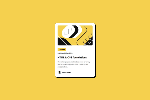
Responsive blog card using flexbox

coyoteshkw•150
@coyoteshkw
A solution to the Blog preview card challenge
View live sitePreview (opens in new tab)View codeCode (opens in new tab)

Solution retrospective


What are you most proud of, and what would you do differently next time?

I noticed that there may be more than one card__tag and card__author. So I create a wrapper just in case.

And I checked the Figma design file and found the space is the same. So I decide to use gap property controlling the space.

What challenges did you encounter, and how did you overcome them?
  • use variables

I realized if I use variable in CSS, it's easier to make my webpage responsive. Example:

:root {
  --font-small: 16px;
  --font-smaller: 14px;
  --font-big: 24px;
}

when max-width < 375px, I can modify this to make it done everywhere.

@media screen and (max-width: 375px) {
  :root {
    --font-smaller: 12px;
    --font-small: 14px;
    --font-big: 20px;
  }
}
  • import local fonts using @font-face

I never used it, that's funny. And I found on src format() must use truetype instead of ttf.

@font-face {
  font-family: 'Figtree Medium';
  src: url(./assets/fonts/static/Figtree-Medium.ttf) format('truetype');
  font-weight: normal;
  font-style: normal;
}
  • serif and sans-serif and why use them

sans-serif is easier for people to read and a better choice. Serif is more often used in places with lots of text, such as body text.

  • let pic fill the parent element

I don't know why but only

.card__img {
  overflow: hidden;
  border-radius: 10px;
  width: 336px;
  height: 200px;
}

.card__img img {
  object-fit: cover;
  width: 100%;
  height: 100%;
}

will work nice. width, height 100% and object-fit:cover necessary.

  • prepare in advance

I noticed that there may be more than one card__tag and card__author. So I create wrapper just in case.

  • border-radius 20/10/5

maybe child element border radius can /2 to make it beautiful.

  • use flex(or grid)

I checked the figma design file and found the space is same. So I decide to use gap property controlling the space.

I also tried grid layout because I thought it was a simpler solution, but it gave me unexpected spacing so I gave up.

What specific areas of your project would you like help with?

I fixed the width and height, but I'm not sure that's a good solution. And I use flex layout to make my card center, if I cancel the height and width, the width will change when larger the browser.

Code
Select a file

Please log in to post a comment

Log in with GitHub

Community feedback

  • atif128873806•30
    @atif128873806
    Posted 7 months ago

    nice

Join our Discord community

Join thousands of Frontend Mentor community members taking the challenges, sharing resources, helping each other, and chatting about all things front-end!

Join our Discord

Stay up to datewith new challenges, featured solutions, selected articles, and our latest news

Frontend Mentor

  • Unlock Pro
  • Contact us
  • FAQs
  • Become a partner

Explore

  • Learning paths
  • Challenges
  • Solutions
  • Articles

Community

  • Discord
  • Guidelines

For companies

  • Hire developers
  • Train developers
© Frontend Mentor 2019 - 2025
  • Terms
  • Cookie Policy
  • Privacy Policy
  • License

Oops! 😬

You need to be logged in before you can do that.

Log in with GitHub

Oops! 😬

You need to be logged in before you can do that.

Log in with GitHub

How does the accessibility report work?

When a solution is submitted, we use axe-core to run an automated audit of your code.

This picks out common accessibility issues like not using semantic HTML and not having proper heading hierarchies, among others.

This automated audit is fairly surface level, so we encourage to you review the project and code in more detail with accessibility best practices in mind.

How does the CSS report work?

When a solution is submitted, we use stylelint to run an automated check on the CSS code.

We've added some of our own linting rules based on recommended best practices. These rules are prefixed with frontend-mentor/ which you'll see at the top of each issue in the report.

The report will audit all CSS, SCSS and Less files in your repository.

How does the HTML validation report work?

When a solution is submitted, we use html-validate to run an automated check on the HTML code.

The report picks out common HTML issues such as not using headings within section elements and incorrect nesting of elements, among others.

Note that the report can pick up “invalid” attributes, which some frameworks automatically add to the HTML. These attributes are crucial for how the frameworks function, although they’re technically not valid HTML. As such, some projects can show up with many HTML validation errors, which are benign and are a necessary part of the framework.

How does the JavaScript validation report work?

When a solution is submitted, we use eslint to run an automated check on the JavaScript code.

The report picks out common JavaScript issues such as not using semicolons and using var instead of let or const, among others.

The report will audit all JS and JSX files in your repository. We currently do not support Typescript or other frontend frameworks.

Oops! 😬

You need to be logged in before you can do that.

Log in with GitHub