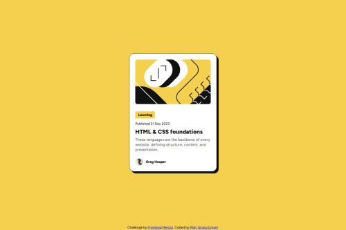
Responsive Blog Card with Flexbox layout and media query scaling

Solution retrospective
I'm most proud of how clean, semantically structured, and responsive my layout turned out. I implemented a mobile-first approach using relative units (rem, %) combined with Flexbox for layout alignment and spacing. I also utilized CSS custom properties (--var) to manage consistent font sizes, colors, and spacing throughout the design. It felt great to see the card maintain its structure and readability across screen sizes.
If I were to do this again, I would round my media query breakpoints to more common values (like 420px instead of 417.431px) for better readability and maintainability. I’d also consider improving accessibility, such as adding more descriptive alt text and implementing keyboard focus states for interactive elements like the title link.
One challenge I faced was getting the spacing and alignment right between the image, content section, and author block. The design looked slightly off when I used fixed units early on, especially when resizing the viewport. I overcame this by switching to relative units and ensuring that spacing was handled using scalable properties like margin-bottom, gap, and padding in rem.
Another small challenge was ensuring that the hover effect on the title looked subtle yet noticeable. I added a hover state that changes the title color and applied a transition for a smoother effect. I also struggled a bit with how to scale the font sizes across breakpoints, but defining both mobile and desktop values in :root made it easier to manage via media queries.
I'd really appreciate feedback on the way I structured the card layout with Flexbox and relative units. Are there cleaner or more scalable approaches I could take, especially regarding spacing and responsiveness?
I'd also love to know if there's a better practice for managing font size transitions across breakpoints using custom properties. Lastly, if there are any improvements I can make in terms of accessibility (semantic HTML, alt text, keyboard navigation), I’m open to all suggestions.
Please log in to post a comment
Log in with GitHubCommunity feedback
- @MarziaJalili
Welcome to the empire of cool! 🎉🥳🎉
🌟 A tiny tip on a11y to consider in your next masterpieces:
✅ The <div> element should be our last choice while writing the setup as it doesn't carry any semantic meaning, man.
✅ In this project, you can:
1️⃣ Swap the <div class="card"> for the <article> element to represent some standalone content.
2️⃣ The <div class="authorization"> for the <footer> element.
Great work overall — keep on conquering! 💪😎
Marked as helpful - @umam-z
Hi! Thank you so much for the helpful feedback — I really appreciate it. 🙌
I’ve reviewed the issues you pointed out and made the necessary adjustments to improve both accessibility and code quality. Your insights helped me a lot in refining the project. If there’s anything else I can improve, feel free to let me know. Thanks again!

Join our Discord community
Join thousands of Frontend Mentor community members taking the challenges, sharing resources, helping each other, and chatting about all things front-end!
Join our Discord