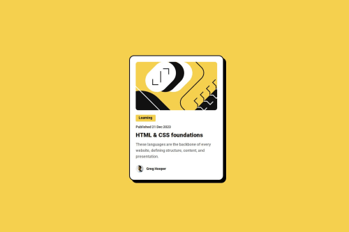
Responsive Blog Card with HTML & CSS

Solution retrospective
I'm proud of how far I’ve come from my previous project. In this blog card design, I was able to implement a clean layout using flexbox, apply good use of typography with Google Fonts, and create a component that actually looks like something you'd find on a real website. Compared to my earlier QR code project, this one feels more polished, detailed, and functional. I’m also proud that I managed to keep the styling clean and consistent — it’s visually appealing without being overcomplicated.
What challenges did you encounter, and how did you overcome them?One of the main challenges I faced was balancing spacing and typography. It was tricky to make sure everything had enough breathing room without making the card feel too stretched or empty.
What specific areas of your project would you like help with?I'd love help making the blog card more responsive — especially tips on using media queries or CSS Grid to adapt the layout for smaller devices without breaking the design.
Please log in to post a comment
Log in with GitHubCommunity feedback
- P@mkerr-github
Looks great, well done !
"I'd love help making the blog card more responsive — especially tips on using media queries"
Basically, you can use media queries, where you can specify in the CSS that certain properties and sizes should change once the pixel size of the screen reaches a certain size.
Here is a nice short explanation as well on W3 schools:
https://www.w3schools.com/css/css_rwd_mediaqueries.asp
For responsive purposes the convention is to convert these measurements to "rem", to do so divide them by 16 (as the base rem is 16px).
Then use max-width to set the large size and min-width to set the small size.
The convention is to use rem and sometimes em, instead of pixels for most items, as they are more responsive. pixels can be used for small elements like icons and buttons where you do not want the size to change even on small screens.
More details here: https://austingil.com/px-or-rem-in-css/#:~:text=Pixels%20are%20an%20absolute%20unit,the%20equivalent%20of%2024%20pixels.
If you found anything in this comment helpful, please remember to click the "mark as helpful" button. Thank you!
Keep up the good work, and keep going! 👋
- @glrodriperez98
Hey! Great job on this project, your progress is really clear, and it's awesome to hear how you're building on your previous work like all of us. The way you described your improvement from the QR code project to this one shows solid growth in both layout and design thinking.
Your use of flexbox and Google Fonts gives the card a clean, modern feel.
The attention to typography and visual balance stands out, it's not easy to keep things looking polished and functional, and you pulled that off nicely.
A couple of suggestions:
-
Since you're thinking about responsiveness, you're on the right track! Starting small with media queries to adjust padding, font sizes, or even switch to a CSS Grid layout at certain breakpoints could really level up the flexibility of your design.
-
You might also want to explore using relative units like em, rem, or % instead of fixed px values in some places, this helps layouts scale more naturally across screen sizes. You used % once or twice but could be worth exploring more!
The one other thing I noticed is that your border shadow is a little bit thicker around the top and left than it is in the design. This is something I struggled with as well! If you get any additional feedback regarding that part I'd love to hear it.
All in all it was a great solution and you're definitely on your way to becoming a developer!
Kind regards, G
-


Join our Discord community
Join thousands of Frontend Mentor community members taking the challenges, sharing resources, helping each other, and chatting about all things front-end!
Join our Discord