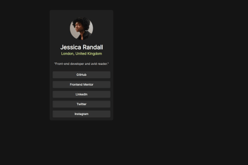
Skip to content
  • Unlock Pro
  • Log in with GitHub
Solution
Submitted over 1 year ago

Responsive Blog links

Valeo•250
@Thessssift
A solution to the Social links profile challenge
View live sitePreview (opens in new tab)View codeCode (opens in new tab)

Solution retrospective


What are you most proud of, and what would you do differently next time?

Progress .

What challenges did you encounter, and how did you overcome them?

links Grid-ing .

What specific areas of your project would you like help with?

Grid .

Code
Select a file

Please log in to post a comment

Log in with GitHub

Community feedback

  • Adann Jacinto•790
    @DanCodeCraft
    Posted over 1 year ago

    Hey @Thessssift, good job. It's a good starting point the way it is now.

    Design:

    • Centralize the main container on the screen. You can do that with CSS, in the body.
    • The colors are a little bit off when hovering over the buttons. The same goes for the location.
    • The font size and proportions are important to create a good hierarchy, leading your potential customer to where you want to.

    Code:

    • The first thing I noticed, is that you did not make a CSS reset. This should become a good habit of yours.
    • Giving classes to everything you write in HTML is a good idea as well. Imagine you have a longer project. It would be just too difficult to manage the styling this way.
    • The buttons could be done with a <a> or <button> element. For this page specifically, it wouldn't do much, but for accessibility purposes, and in a real-life scenario, having each as a paragraph would not work.
    • Adding small details like a transition for when hovering over buttons is one extra line, but such a good result!
    • Also, consider learning about different unit measures.

    Keep up the good work.

    Marked as helpful
  • Victoria Azola Silva•1,290
    @VickyAzola
    Posted over 1 year ago

    Hi there! 👋 Awesome job completing this challenge. Here are a few tips that may interest you:

    • First it is important to use semantic HTML for accessibility purposes. Try wrapping your main content in the <main> tag instead of a <div> .
    • Also use consecutive headings and don't use them solely for styling purposes. They are supposed to be descriptive tags that let the user know the level of importance of the text.
    • The code would look something like this:
    <main class="container">
        <img src="assets/images/avatar-jessica.jpeg" alt="">
        <h1>Jessica Randall</h1>
        <h2>London, United Kingdom</h2>
    .....
    </main>
    
    • Second, for the links instead of <p> that represent a paragraph, you should use an <a> since this tag is especially made for links. Here,  the code would look like this:
    <main class="container">
    .....
       <div class="links">
          <a class="button" href="">GitHub</a>
          <a class="button" href="">Frontend Mentor</a>
          <a class="button" href="">LinkedIn</a>
          <a class="button" href="">Twitter</a>
          <a class="button" href="">Instagram</a>
        </div>
    </main>
    

    In here, the href is empty since we don't really have links to put, but in a real setting, there would be links to the sites listed.

    For your CSS, I suggest:

    • In the root, only use one box-sizing property (the border-box is more commonly used).
    :root {
        background-color: var(--Off-Black);
       box-sizing: border-box; 
        --White: hsl(0, 0%, 100%);
        --Grey: hsl(0, 0%, 20%);
        --Dark-Grey: hsl(0, 0%, 12%);
        --Off-Black: hsl(0, 0%, 8%);
        font-size: 17px;
    }
    
    • The body shouldn't be the card; that's what the container class is for. So in the body, we add the most general properties and center the card vertically and horizontally. Also, it is important to add the min-height to allow the vertical center.
    body {
        font-family: 'Inter';
        display: flex;
        align-items: center;
        justify-content: center;
        min-height: 100vh;
    }
    

    Here, the @media is not necessary since the design is the same for desktop and mobile.

    • The container is the card, so here we add all that is necessary for its general styling. I personally like to add a specific width to control the size it takes.
    .container {
        width: 22rem;
        margin: 1rem;
        padding: 1rem 1.2rem;
        display: flex;
        flex-direction: column;
        align-items: center;
        text-align: center;
        color: var(--White);
        border-radius: 10px;
        background-color: var(--Dark-Grey);
    }
    
    • Since you have a wrapper for the links, you should use it to set the width of the div.
    .links {
        width: 100%;
    }
    
    • For the buttons, I deleted the padding on the sides since it is no longer necessary; now the width of the buttons is 100% of their container.
    .button {
        padding: .9rem 0 ;
        background-color: hsl(0, 0%, 20%);
        border-radius: 5px;
        font-weight: bold;
    }
    
    • For the button hover, you were missing the change to the text color, so I added that and a cursor pointer.
    .button:hover {
        background-color: hsl(75, 94%, 57%);
        cursor: pointer;
        color: hsl(0, 0%, 20%);
    }
    
    • For the green text, I removed the style inline in the HTML and added the color here, also made the font smaller, according to the design.
    h2 {
        margin-top: 5px ;
        font-size: .9rem;
        color: hsl(75, 94%, 57%);
    }
    

    Hope this helps!

Join our Discord community

Join thousands of Frontend Mentor community members taking the challenges, sharing resources, helping each other, and chatting about all things front-end!

Join our Discord
Frontend Mentor logo

Stay up to datewith new challenges, featured solutions, selected articles, and our latest news

Frontend Mentor

  • Unlock Pro
  • Contact us
  • FAQs
  • Become a partner

Explore

  • Learning paths
  • Challenges
  • Solutions
  • Articles

Community

  • Discord
  • Guidelines

For companies

  • Hire developers
  • Train developers
© Frontend Mentor 2019 - 2025
  • Terms
  • Cookie Policy
  • Privacy Policy
  • License

Oops! 😬

You need to be logged in before you can do that.

Log in with GitHub

Oops! 😬

You need to be logged in before you can do that.

Log in with GitHub

How does the accessibility report work?

When a solution is submitted, we use axe-core to run an automated audit of your code.

This picks out common accessibility issues like not using semantic HTML and not having proper heading hierarchies, among others.

This automated audit is fairly surface level, so we encourage to you review the project and code in more detail with accessibility best practices in mind.

How does the CSS report work?

When a solution is submitted, we use stylelint to run an automated check on the CSS code.

We've added some of our own linting rules based on recommended best practices. These rules are prefixed with frontend-mentor/ which you'll see at the top of each issue in the report.

The report will audit all CSS, SCSS and Less files in your repository.

How does the HTML validation report work?

When a solution is submitted, we use html-validate to run an automated check on the HTML code.

The report picks out common HTML issues such as not using headings within section elements and incorrect nesting of elements, among others.

Note that the report can pick up “invalid” attributes, which some frameworks automatically add to the HTML. These attributes are crucial for how the frameworks function, although they’re technically not valid HTML. As such, some projects can show up with many HTML validation errors, which are benign and are a necessary part of the framework.

How does the JavaScript validation report work?

When a solution is submitted, we use eslint to run an automated check on the JavaScript code.

The report picks out common JavaScript issues such as not using semicolons and using var instead of let or const, among others.

The report will audit all JS and JSX files in your repository. We currently do not support Typescript or other frontend frameworks.

Oops! 😬

You need to be logged in before you can do that.

Log in with GitHub

Oops! 😬

You need to be logged in before you can do that.

Log in with GitHub