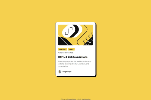
Submitted over 1 year agoA solution to the Blog preview card challenge
Responsive blog page preview using flexbox
vite, bem

@trskldnt
Solution retrospective
What are you most proud of, and what would you do differently next time?
I got acquainted with relative units of measurement rem and the css clamp function, which allows you to set a value between the minimum and maximum, and make the font size adaptive (for example) without using media queries or javascript
What challenges did you encounter, and how did you overcome them?setting an adaptive font for a mobile layout without using media queries
What specific areas of your project would you like help with?Please take a look and tell me what could be improved, I would be grateful for your feedback
Code
Loading...
Please log in to post a comment
Log in with GitHubCommunity feedback
No feedback yet. Be the first to give feedback on trskldnt's solution.
Join our Discord community
Join thousands of Frontend Mentor community members taking the challenges, sharing resources, helping each other, and chatting about all things front-end!
Join our Discord