Submitted over 1 year agoA solution to the Blog preview card challenge
Responsive Blog preview card
sass/scss

@Negligence
Solution retrospective
What are you most proud of, and what would you do differently next time?
- Mixins for Media Queries
I'm very happy to be able to use my mixins @include mobile-media-query(1440px) and @include desktop-media-query(374px).
From now on this is how I'm going to create my media queries.
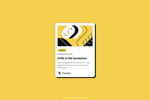
- Image Wrapper
I learned the benefit of wrapping a container on my img
In this particular design, it was needed because resizing the image itself did not reflect the design.
I needed to set a smaller container size, added overflow:hidden; to hide the extra contents, and also add display grid to be able to set justify-content: center; to the cropped image.
.blog-image {
  width: 100%;
  height: rem(200px);
  border-radius: rem(10px);
  justify-self: center;
  justify-content: center;
  overflow: hidden;
}
Code
Loading...
Please log in to post a comment
Log in with GitHubCommunity feedback
No feedback yet. Be the first to give feedback on Jan's solution.
Join our Discord community
Join thousands of Frontend Mentor community members taking the challenges, sharing resources, helping each other, and chatting about all things front-end!
Join our Discord