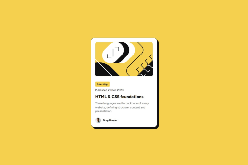
Skip to content
  • Unlock Pro
  • Log in with GitHub
Solution
Submitted 3 months ago

Responsive Blog Preview Card

sj•100
@subjectiverealityy
A solution to the Blog preview card challenge
View live sitePreview (opens in new tab)View codeCode (opens in new tab)

Solution retrospective


What challenges did you encounter, and how did you overcome them?

When I was pushing to Git, I kept making mistakes on the README.md file and had to keep repeating the process of git add, git commit and git push. I have now gotten it to read the way I want it to. The problems originated from using the wrong file paths for the README.md file and my project's screenshot initially.

Code
Select a file

Please log in to post a comment

Log in with GitHub

Community feedback

  • P
    Kamran Kiani•2,780
    @kaamiik
    Posted 3 months ago

    Hi. Some notes for your code:

    HTML

    • A proper page structure inside <body> should look like this:
    <body>
      <header>...</header>
      <main>...</main>
      <footer>...</footer>
    </body>
    

    Since this is a card component, we only need the <main> element.


    • For <img> tag you need alt text to describe the image. Although for decorative and avatar images You need to add an empty alt="" because there is no information in the photo. The point is you have to use alt.

    • Follow proper heading hierarchy:
      • Each page should have one <h1>
      • For components that are part of a larger page, use <h2> instead
      • This maintains proper document structure while reflecting component hierarchy

    • You do not need to wrap the person name into a <span>. Simply use a p tag.

    CSS Best Practices

    • Start with a proper CSS reset (Andy Bell or Josh Comeau resets are recommended)

    • Use viewport height properly:

      /* Instead of: */
      body {
        height: 100vh;
      }
      
      /* Use: */
      body {
        min-height: 100vh;
      }
      

    This ensures content can expand beyond viewport height


    • Avoid fixed widths and height for text containers:
      • Remove width: 384px and height: 522px from .wrapper
      • Use max-width for better text container adaptability
    • Use relative units:
      • rem for font-size and max-width instead of px
      • Learn more about this here

    • Follow mobile-first approach:
      • Start with mobile styles as the default
      • Use min-width in media queries
      • Use em units for breakpoints

    Example media query:

    @media (min-width: 40em) {
      /* Desktop styles */
    }
    
  • Stash443•120
    @Stash443
    Posted 3 months ago

    The solution was well built, as well as the responsive(media query) part was well structured and understandable. I don't see any improvements that need to be implemented here. Well done.

Join our Discord community

Join thousands of Frontend Mentor community members taking the challenges, sharing resources, helping each other, and chatting about all things front-end!

Join our Discord
Frontend Mentor logo

Stay up to datewith new challenges, featured solutions, selected articles, and our latest news

Frontend Mentor

  • Unlock Pro
  • Contact us
  • FAQs
  • Become a partner

Explore

  • Learning paths
  • Challenges
  • Solutions
  • Articles

Community

  • Discord
  • Guidelines

For companies

  • Hire developers
  • Train developers
© Frontend Mentor 2019 - 2025
  • Terms
  • Cookie Policy
  • Privacy Policy
  • License

Oops! 😬

You need to be logged in before you can do that.

Log in with GitHub

Oops! 😬

You need to be logged in before you can do that.

Log in with GitHub

How does the accessibility report work?

When a solution is submitted, we use axe-core to run an automated audit of your code.

This picks out common accessibility issues like not using semantic HTML and not having proper heading hierarchies, among others.

This automated audit is fairly surface level, so we encourage to you review the project and code in more detail with accessibility best practices in mind.

How does the CSS report work?

When a solution is submitted, we use stylelint to run an automated check on the CSS code.

We've added some of our own linting rules based on recommended best practices. These rules are prefixed with frontend-mentor/ which you'll see at the top of each issue in the report.

The report will audit 1st-party linked stylesheets, and styles within <style> tags.

How does the HTML validation report work?

When a solution is submitted, we use html-validate to run an automated check on the HTML code.

The report picks out common HTML issues such as not using headings within section elements and incorrect nesting of elements, among others.

Note that the report can pick up “invalid” attributes, which some frameworks automatically add to the HTML. These attributes are crucial for how the frameworks function, although they’re technically not valid HTML. As such, some projects can show up with many HTML validation errors, which are benign and are a necessary part of the framework.

Oops! 😬

You need to be logged in before you can do that.

Log in with GitHub

Oops! 😬

You need to be logged in before you can do that.

Log in with GitHub