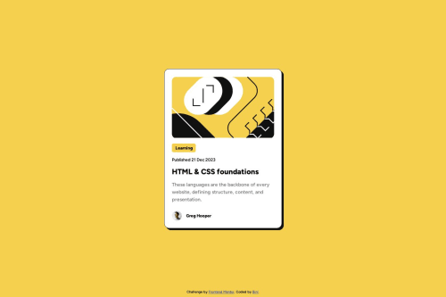
Submitted over 1 year agoA solution to the Blog preview card challenge
Responsive blog preview card

@binzam
Code
Please log in to post a comment
Log in with GitHubCommunity feedback
- @AGutierrezR
Hello there 👋. Good job on completing the challenge!
I have some suggestions about your code that might interest you.
General Structure and HTML:
- Wrap the primary content within the
<main>tag instead of using it as a standalone component like a<div>. - All the content should be contained within landmarks. Every page minimally needs a
<main>element. - Consider using
<h2>as a wrapper for the anchor tag for the title - Consider using
<span>or<time>instead of paragraphs for elements that are not actual paragraphs like Learning or Published....
CSS and Styling:
- Avoid using
pxforfont-size, you could read this article to learn why. Letter spacing and line height must not be inpx, useremfor all the font-related properties. - Instead of fixed widths, employ
max-widthandmin-widthfor flexible and responsive design. - The
bodyshould not have itsheightlimited. Instead of usingheight: 100vh, usemin-height.
Accessibility and Semantic HTML:
- The icons/illustration images are decorative, so their alt text must be empty:
alt="". - Profile image could benefit from a more descriptive alt text, like
alt="Headshot of Gary Hooper". - Maintain semantic HTML structure by using appropriate elements for their intended purposes.
I hope you find this helpful 😁. Most importantly, your submitted solution is fantastic!
Happy coding!
- Wrap the primary content within the

Join our Discord community
Join thousands of Frontend Mentor community members taking the challenges, sharing resources, helping each other, and chatting about all things front-end!
Join our Discord