Skip to content
  • Unlock Pro
  • Log in with GitHub
Solution
Submitted 18 days ago

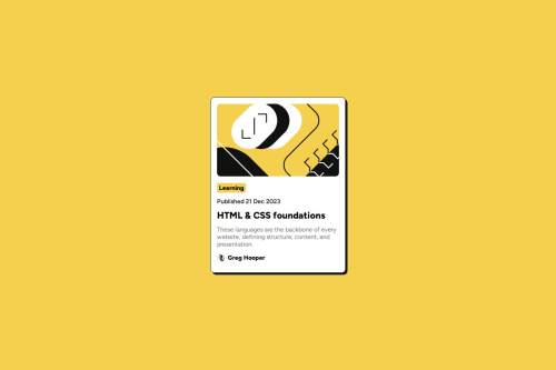
Responsive Blog Preview Card using CSS grid

Randy Sekyere•40
@Randy-22
A solution to the Blog preview card challenge
View live sitePreview (opens in new tab)View codeCode (opens in new tab)

Solution retrospective


What are you most proud of, and what would you do differently next time?

I'm most proud of how clean and responsive the final layout turned out using only HTML and CSS. I was able to implement modern techniques like Flexbox for alignment and the clamp() function for responsive typography without using media queries. Additionally, using BEM naming conventions kept my CSS organized and maintainable, which made the project feel more professional and scalable.

What challenges did you encounter, and how did you overcome them?

One of the main challenges I encountered was making the web page responsive without relying on conventional CSS media queries. I wanted to maintain responsiveness while keeping the CSS lean and scalable.

To overcome this, I explored and implemented the CSS clamp() function for responsive typography and spacing. This allowed me to define flexible values that adapt based on the viewport width, effectively replacing the need for media queries in many cases. It was a learning curve at first, but it helped me understand how modern CSS features can simplify responsiveness in web design.

What specific areas of your project would you like help with?

While I'm proud of the current implementation, there are a few areas I'd like guidance or feedback on to improve further:

Responsive Design Without Media Queries: I used the clamp() function to handle responsiveness, but I’m still exploring best practices for using it effectively across different elements like padding, margins, and container widths.

Code
Select a file

Please log in to post a comment

Log in with GitHub

Community feedback

  • Harsh Kumar•3,230
    @thisisharsh7
    Posted 18 days ago

    Hey, this is solid work! 👏 Your use of clamp() for responsiveness shows you’re clearly thinking beyond the basics and exploring what modern CSS can really do. It's awesome how you've minimized reliance on media queries while still achieving a clean, responsive design — not an easy task!

    Your layout looks polished, and your BEM approach definitely helps in keeping the CSS structured and scalable. One tip for refining your use of clamp(): it often works best when you define the values based on a logical progression across your layout — for example, aligning clamp() values for padding and font sizes to a consistent scale so your layout feels more cohesive as it resizes.

    Also, if you ever need a hybrid approach, combining clamp() with a few strategic media queries (especially for layout shifts) can sometimes offer the best of both worlds without making the CSS heavy.

    Keep pushing your skills like this — the foundation you're building is excellent!

    Marked as helpful
  • DaniloJesus21•30
    @DaniloJesus21
    Posted 18 days ago

    Well done!

Join our Discord community

Join thousands of Frontend Mentor community members taking the challenges, sharing resources, helping each other, and chatting about all things front-end!

Join our Discord
Frontend Mentor logo

Stay up to datewith new challenges, featured solutions, selected articles, and our latest news

Frontend Mentor

  • Unlock Pro
  • Contact us
  • FAQs
  • Become a partner

Explore

  • Learning paths
  • Challenges
  • Solutions
  • Articles

Community

  • Discord
  • Guidelines

For companies

  • Hire developers
  • Train developers
© Frontend Mentor 2019 - 2025
  • Terms
  • Cookie Policy
  • Privacy Policy
  • License

Oops! 😬

You need to be logged in before you can do that.

Log in with GitHub

Oops! 😬

You need to be logged in before you can do that.

Log in with GitHub

How does the accessibility report work?

When a solution is submitted, we use axe-core to run an automated audit of your code.

This picks out common accessibility issues like not using semantic HTML and not having proper heading hierarchies, among others.

This automated audit is fairly surface level, so we encourage to you review the project and code in more detail with accessibility best practices in mind.

How does the CSS report work?

When a solution is submitted, we use stylelint to run an automated check on the CSS code.

We've added some of our own linting rules based on recommended best practices. These rules are prefixed with frontend-mentor/ which you'll see at the top of each issue in the report.

The report will audit 1st-party linked stylesheets, and styles within <style> tags.

How does the HTML validation report work?

When a solution is submitted, we use html-validate to run an automated check on the HTML code.

The report picks out common HTML issues such as not using headings within section elements and incorrect nesting of elements, among others.

Note that the report can pick up “invalid” attributes, which some frameworks automatically add to the HTML. These attributes are crucial for how the frameworks function, although they’re technically not valid HTML. As such, some projects can show up with many HTML validation errors, which are benign and are a necessary part of the framework.

Oops! 😬

You need to be logged in before you can do that.

Log in with GitHub

Oops! 😬

You need to be logged in before you can do that.

Log in with GitHub