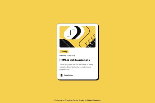
Responsive Blog Preview Card using Flexbox

Solution retrospective
I am proud of how responsive I made the project in the first try this time.
What specific areas of your project would you like help with?One thing I could not figure out is how I can send the footer to the bottom of the page. Would appreciate some help with that.
One thing I noticed is when I set the height of the image as per the figma specifications, the border-radius disappears. It reappears when I set object-fit to cover. Would love an explanation as to why that is happening.
I had an issue with maintaining all the different font types and their sizes and would often get confused. How can I better deal with fonts?
Please log in to post a comment
Log in with GitHubCommunity feedback
- @bhuvi819381
Hey brother,
Your solution looks great! 🚀
Here are a few suggestions for improvement:
- 🔠 Use One <h1> Per Page
Each page should have only one <h1> tag for proper structure.
- 📏 Follow Heading Hierarchy
Use headings in order: <h1> → <h2> → <h3> instead of skipping levels.
- 📐 Avoid Fixed Height
Instead of height: 500px;, use min-height or flexible layouts to ensure responsiveness.
- 📱 Reduce Media Queries
You don’t need a media query for this specific case. Avoid excessive media queries; use flexible units like rem, %, or flexbox instead.
Additional Suggestions:
🛠️ Check for Errors: After submitting the solution, always review the HTML and accessibility error report. If you find errors, resolve them.
Keep up the great work! 💪
Marked as helpful - @ChrisTariah
what are the different ways to align every element on the page,to achieve the layout.


Join our Discord community
Join thousands of Frontend Mentor community members taking the challenges, sharing resources, helping each other, and chatting about all things front-end!
Join our Discord