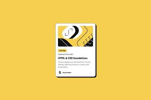
Responsive Blog Preview Card using HTML and CSS

Solution retrospective
What I am most proud of is that I was able to implement responsive design in this challenge. I have used media queries before to implement it but CSS clamp can make it simpler and you can just write it in one line.
What challenges did you encounter, and how did you overcome them?I had trouble finding some alternative for media queries on implementing response design but after doing googling, I have found that you can use the CSS clamp function just like this:
width: clamp(327px, 40vw, 384px);
When you go to the design comparison section of my solution, you can see that I had a little bit of some spacing issues inside of my card container. I tried to follow the design file as close as possible but I can't find a solution for that issue. May I ask what went wrong?
Please log in to post a comment
Log in with GitHubCommunity feedback
No feedback yet. Be the first to give feedback on Schindler Dumagat’s solution.
Join our Discord community
Join thousands of Frontend Mentor community members taking the challenges, sharing resources, helping each other, and chatting about all things front-end!
Join our Discord