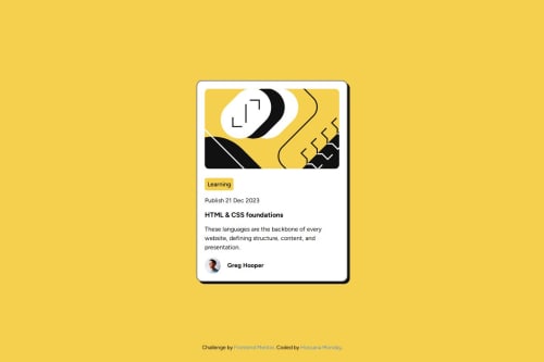
Submitted 5 months agoA solution to the Blog preview card challenge
responsive blog preview card using html and css
accessibility

@hossygifty
Solution retrospective
What are you most proud of, and what would you do differently next time?
this was one of the fun thing i have done, i didn't really find it difficult because i now understand the concept of card
What challenges did you encounter, and how did you overcome them?creating the side side shadow effect for the box i asked Chatgbt for help
Code
Please log in to post a comment
Log in with GitHubCommunity feedback
- @codeBloom361
Great job completing this challenge! Here are my suggestions: Using the font-weight property, you can make the heading bolder, making it look more like the design.
- Avoid using unnecessary media queries. Adjust the height and width for mobile first, then add the media query for desktop.
- Use CSS variables for background color and font color etc. It will make it more reusable and manageable. With that, your code will be more efficient and accessible.
Marked as helpful

Join our Discord community
Join thousands of Frontend Mentor community members taking the challenges, sharing resources, helping each other, and chatting about all things front-end!
Join our Discord