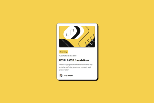
Submitted 6 months agoA solution to the Blog preview card challenge
Responsive Blog Preview Card using Sass and Semantic HTML
accessibility, sass/scss, semantic-ui

@GeorgePapalazaridis
Solution retrospective
What are you most proud of, and what would you do differently next time?
-
Proud of:
- Successfully implementing a fully responsive layout using
clamp()for dynamic scaling. - Leveraging Sass for modular and maintainable styling.
- Ensuring semantic HTML for accessibility and better SEO.
- Achieving a clean and visually appealing design.
- Successfully implementing a fully responsive layout using
-
What to do differently:
- Explore using CSS Grid for layout to enhance flexibility.
- Test the design on a wider variety of devices.
- Add animations for a more interactive user experience.
-
Challenges:
- Handling responsive design across various screen sizes, especially scaling fonts dynamically.
- Ensuring the design closely matched the Figma file provided in the challenge.
-
Solutions:
- Used
clamp()for both width and font sizes to create a scalable and fluid design. - Debugged issues with hover and focus states by refining CSS transitions and removing unnecessary box shadows.
- Used
- Feedback on the organization and readability of the Sass structure.
- Suggestions on improving hover/focus state accessibility.
- Recommendations for optimizing the responsive design further, especially for smaller screens.
Code
Loading...
Please log in to post a comment
Log in with GitHubCommunity feedback
No feedback yet. Be the first to give feedback on George Pap.'s solution.
Join our Discord community
Join thousands of Frontend Mentor community members taking the challenges, sharing resources, helping each other, and chatting about all things front-end!
Join our Discord