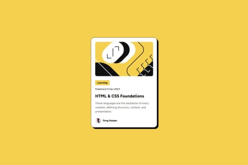
Responsive Blog Preview Card with CSS Alignment and Flexbox

Solution retrospective
What I most proud of is that I could make the project responsive and try to make it look as close as possible the the design. Next time what I would differently is I would make the card grow from small to large based on the screen sizes rather than make it appear larger instantly
What challenges did you encounter, and how did you overcome them?I tried to use outline rather than border thinking that the outline will not take up more space for the card ended up it appears square on mobile devices so later I switch back to use border and yes the border is round with the card.
What specific areas of your project would you like help with?I want to know of there are tools that we could test our project on mobile devices.
Please log in to post a comment
Log in with GitHubCommunity feedback
- @Md-Mubin
You can use the live site in your phone that you created and posted here. Or, you can use browser inspect. Right click on browser and you can inspect it. Than you can change the the screen width and height. And customize it in responsive codes. Make sure to use Firefox browser for the responsive insted of Chrome. Chrome gives better UI/animation but in development to fix/make the responsive better use firefox browser as it's engine is better for it.

Join our Discord community
Join thousands of Frontend Mentor community members taking the challenges, sharing resources, helping each other, and chatting about all things front-end!
Join our Discord