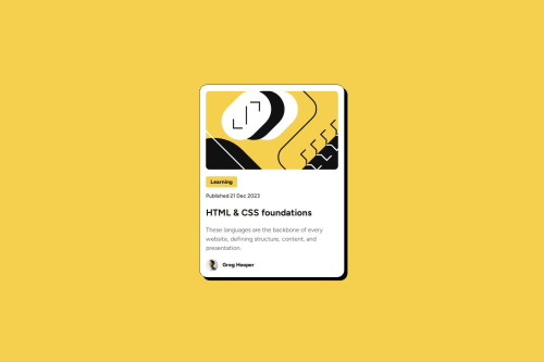
Submitted 4 months agoA solution to the Blog preview card challenge
Responsive blog preview card with HTML/CSS

P
@SKszymek
Solution retrospective
What specific areas of your project would you like help with?
Any feedback will be great.
Code
Please log in to post a comment
Log in with GitHubCommunity feedback
- @gmagnenat
Hi, here is a review with some suggestions.
- Use
min-height: 100svhon the body to make sure the layout adapts properly when content grows. - There are no focusable elements on your solution. Since this is a blog preview card, the title should include a link to the full post.
- The title has an interactive indication but is wrapped in a
<p>tag. This should be a heading (<h2>or<h3>) with a link inside. - Avoid words like "picture" or "photo" in alt text. Screen readers already announce the element as an image. The main image here is decorative and should have an empty
alt="". - A
<main>landmark is missing. The card should be inside a<main>tag to help assistive technologies understand the page structure. - The profile image next to the author's name does not need alt text. Since this card is likely on a page with multiple blog previews, having alt text for each author's profile image would create too much redundancy.
- A modern CSS reset is missing. Adding one will help with consistency across browsers. Look into resets from Andy Bell or Josh Comeau.
- Do not change the root font size using percentages. This practice was historically used for easier
remcalculations but causes accessibility issues. Users who increase their browser's default font size may experience unpredictable scaling. - Work mobile-first. The default layout should be for small screens, and a media query with
min-widthinremshould be used to adjust the layout for larger screens if needed.
Let me know if you need further clarifications.
Happy coding !
Marked as helpful - Use

Join our Discord community
Join thousands of Frontend Mentor community members taking the challenges, sharing resources, helping each other, and chatting about all things front-end!
Join our Discord