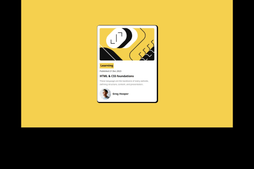
Responsive Blog Preview using HTML and CSS

Solution retrospective
First off i am proud of how i tackle the project heads on. Secondly, through this project i was able to learn a new css property which is the "clamp" property. what i would do differently next time would probably to be in the right frame of mind before taking the next challenge.
What challenges did you encounter, and how did you overcome them?I had challenges structuring the web content. I was able to overcome it through persistence and many try by error.
What specific areas of your project would you like help with?I tried to reduce the avatar image size but to no avail. my subconcious mind kept telling maybe it was because it's in SVG format. i am open to correction tho!
Please log in to post a comment
Log in with GitHubCommunity feedback
- @ImagineBillie
Quick Code Review
-
Fonts & Design
- Import the exact variable font that given in the folder
- Figma files give you more details. worth check it out the spec and match its sizes/weights.
-
Avatar Fix
You have typoid="autor-image"and CSS targets#author-image. Either rename the ID or switch to:.author-profile img { width: 32px; margin-right: 12px; }
Responsive Layout
.container {
  min-height: 100vh;
  padding: 3rem 1rem;
}
.card {
  width: 90vw;
  max-width: 340px;
}
CSS Cleanup & Best Practices
- Consolidate your reset into one * { box-sizing: border-box; margin: 0; padding: 0; }.
- Prefer classes for styling over IDs.
- Use rem or % units for font‑sizes, margins, and paddings to keep everything scalable.
- Leverage your clamp() on html { font-size: clamp(14px, 1vw, 24px); } and build all text using rem so the whole UI scales smoothly.
Marked as helpful -

Join our Discord community
Join thousands of Frontend Mentor community members taking the challenges, sharing resources, helping each other, and chatting about all things front-end!
Join our Discord