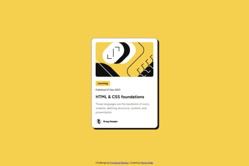
Submitted over 1 year agoA solution to the Blog preview card challenge
Responsive Blog Review Card without Media Queries
sass/scss

@MuliroMatt
Solution retrospective
What are you most proud of, and what would you do differently next time?
I'm proud of two things.
- managed to make it responsive without relying on media queries by utilizing a function called
clamp(). - I used
transform()to make a little animation when hovering over the card
It was challenging to make the page responsive without media queries, but i overcame it by using clamp().
I would like to know ways I can make my website responsive, how to write better SASS, and if i used clamp() the right way.
Code
Loading...
Please log in to post a comment
Log in with GitHubCommunity feedback
No feedback yet. Be the first to give feedback on Murilo Matt's solution.
Join our Discord community
Join thousands of Frontend Mentor community members taking the challenges, sharing resources, helping each other, and chatting about all things front-end!
Join our Discord