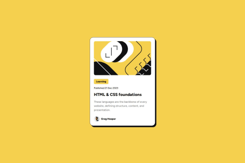
Responsive blog-preview-card using BEM and flexbox

Solution retrospective
Hello!
This time I used the BEM (Block, Element, Modifier) methodology, which is a popular naming convention for classes in HTML and CSS. BEM is useful when it comes to larger, more complex projects when code organization becomes crucial. The idea behind it is to speed up the development process, and ease the teamwork of developers by arranging CSS classes into independent modules. You can learn more about BEM here.
Since my card is just illustrated introduction to some blog post I made the entire blog card clickable, not just an anchor. I did this with a simple JavaScript technique and used the card container as a proxy for the link. Then detected how long the user is taking between mousedown and mouseup and suppress the clicking event if user is likely to be selecting text. There's a few ways to make whole card clickable, but each method have it's own pros and cons. There is also an aspect of accessibility - Read more about inclusive card components
No specific questions, but feedback or a criticism will be appreciated!
Please log in to post a comment
Log in with GitHubCommunity feedback
- @grace-snow
Remember that text should never be in divs or spans alone. Always use a meaningful element.
I wouldn't expect the main image to have an alt description to be honest. To me, that looks decorative.
Try to remember to include a modern css reset at the start of the styles in every project.
I would expect a pseudo in this to make the whole card clickable too. That technique is covered on the inclusive components site
Marked as helpful - @buneeIsSlo
Hey @tediko! Awesome to see you sharing solutions again!
- @uragunz16
Wow!... Pretty Good...


Join our Discord community
Join thousands of Frontend Mentor community members taking the challenges, sharing resources, helping each other, and chatting about all things front-end!
Join our Discord