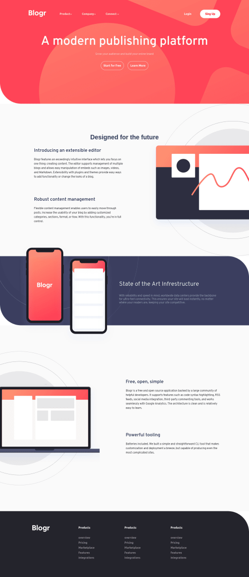
Submitted almost 4 years agoA solution to the Blogr landing page challenge
responsive blogr lading page

@Willearyson
Solution retrospective
blogr lading page, done after a long time, I added knowledge I could to improve the layout
Code
Please log in to post a comment
Log in with GitHubCommunity feedback
- @iceofice
Hi! I also just finished this challenge. I have some feedback for you. I can't find your mobile design and your page is not really responsive. When I tried making it smaller the image is gone or moved outside of the view. For me personally, I like to use
overflow-x: hidden;properties and play around in different sizes. In the menu, I think it will be a better idea to show the submenu on hover also. That's all from me! Hope we can help each other!

Join our Discord community
Join thousands of Frontend Mentor community members taking the challenges, sharing resources, helping each other, and chatting about all things front-end!
Join our Discord