Not Found
Not Found
Not Found
Not Found
Not Found
Not Found
Not Found
Not Found
Not Found
Not Found
Not Found
Not Found
Not Found
Not Found
Not Found
Not Found
Not Found
Not Found
Not Found
Not Found

Submitted

Responsive calculator built with Vanilla JS

#accessibility#sass/scss
Elaineβ€’ 11,420

@elaineleung

Desktop design screenshot for the Calculator app coding challenge

This is a solution for...

  • HTML
  • CSS
  • JS
3intermediate
View challenge

Design comparison


SolutionDesign

Solution retrospective


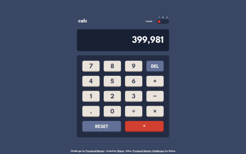
This is my first intermediate project, and I only built this because I already made a calculator app a while ago. Since I've been seeing a number of calculator solutions in my feed, I wanted to see whether I can reuse my old one in this challenge. I ended up rewriting almost all the JS except the event listeners, but this was a really good practice in writing JS classes!

This calculator can be used with the key pad as well, and also I structured the calculator keys in my HTML in a way where a user can use the tab key if they don't want to use the numpad. The tab functionality somewhat mirrors what my Windows calculator is doing, so I think that's alright for now!

I kept the design's initial value in my calculator, but I will probably remove it later after the screenshot is taken. The only thing I need to figure out later is how to change the screenshot browser's settings and keep it in dark mode, so if anyone's got any ideas please let me know πŸ˜†

To build this, I used the calculator by Web Dev Simplified's Kyle as my blueprint; his Vanilla JS calculator is probably the best I've seen so far, so if anyone is interested, do check out his work! Also, I aim to add a second display above the main one for showing the first operand, so hopefully that's coming soon!

Please let me know if there's anything that's broken or not working the way it should. Thank you!

Community feedback

@Aik-202

Posted

Hi Elaine, this is really amazing!!!!!, the theme switcher is really nice, the responsiveness is on point!. But I have a suggestion, I think it will be really nice if the users get to see each of their input displayed as they are typed. For example I want to calculate 3 Γ— 5, When I enter Γ— it doesn't reflect on the display.. till I maybe input another number or click "="... It will be really great if they get to see each of their input as I enter them.

Marked as helpful

1

Elaineβ€’ 11,420

@elaineleung

Posted

@Aik-202 Hi Assurance, thanks for checking it out, and yes, this is a point I noted in my README for further development. I just followed the design given in this challenge, and this is the way they designed it, but I agree with you that it would be better for user experience if they can see the previous operand as well, which is why I included this point as something to add in future versions πŸ™‚

0
Elaineβ€’ 11,420

@elaineleung

Posted

@Aik-202 Hey Assurance, I just made changes to the calculator to include a small display to show the previous input. I didn't want to include every input, as that could require more space and multiple lines, and I wanted to keep the displays one line only. Anyway, this updated version should be better than having no previous input displayed!

0

@Aik-202

Posted

@elaineleung Yeah, I've reviewed the site, it's much better, nice work!!!!!

1
Lucas πŸ‘Ύβ€’ 104,580

@correlucas

Posted

Hello Elaine, congrats for this amazing solution!

Again a pixel perfect solution and what surprises me more is that you don't use Figma files to reach these results!

I like a lot the theme switcher, its really amazing! The coolest is the third theme.

I saw that you've used a div to wrap everything, I did this to a challenge and I was not sure if this is a good practice, to wrap all the content with a div, since there's the main that is more important inside a div that is a block element without meaning, this can causes accessibility issues?

πŸ‘ΎMy rating for this solution: ⭐⭐⭐⭐⭐

Nice solution, as always! Congrats Elaine, its really amazing to see people customizing solution and doing more than the challenge requires.

Marked as helpful

1

Elaineβ€’ 11,420

@elaineleung

Posted

@correlucas Hi Lucas, thank you for the comment! I wish I can take credit for being creative, but the theme switcher is actually part of the challenge, and so are the color schemes πŸ˜†

Thank you also for pointing out the div wrapped around the header and main, and to be honest I don't remember what led me to make that decision! I probably was trying too hard to figure out how to work the switch and the calculator keys that I wasn't really thinking about the overall structure. I think you're right about accessibility, because even though the report is not showing any major issues and even though I have my main and header tags, I would still prefer to use a container instead inside the main and header tags. I'll try changing that later!

1
AntoineCβ€’ 1,180

@AntoineC-dev

Posted

Hi Elaine. Almost pixel perfect ! Impressive.

I will look at your theme switcher tomorrow. I was going for a similar solution with 3 clickable areas but I went back to a single clickable area because I thought that on mobile I often was clicking on the wrong one because the switch on the design is quite small.

Awesome work! Peace :)

Marked as helpful

1

Elaineβ€’ 11,420

@elaineleung

Posted

@AntoineC-dev Hey Antoine, thanks for the comment, which made me test it on my phone just now (which I forgot to do before submitting) πŸ˜‚

I agree, the switch is already small, and on the mobile phone it looks even smaller. I have relatively smaller fingers, and so clicking around was OK, but yeah, I don't think it's good to have it so small, not so good for UX generally. Even other switches on my phone's system UI aren't that small.

1
Md5 daltonβ€’ 1,430

@md5dalton

Posted

Hello Elaine.. Impressive workπŸ‘Œ

If you want your screenshot to match the design's, set your app to load dark mode as the default theme. Then go to your solution's page in frontendmentor, click the Generate Screenshot button. That's it.

Well at least that's how I did mine in one of my solutions. Hope that helpsπŸ‘

Marked as helpful

1

Elaineβ€’ 11,420

@elaineleung

Posted

@md5dalton Thank you for the tip! Will be sure to try it out πŸ™‚

0
Md5 daltonβ€’ 1,430

@md5dalton

Posted

@elaineleung you're welcome. Happy coding πŸ‘Œ

1
Nwali Josephβ€’ 180

@Source-Web

Posted

Hello, Elaine. I must say I love your theme toggle and as always, you didn't fail to reproduce the design to look like the original.

I have to agree with @Aik-202, the screen inputs should be seen before the screen value is evaluated. I likewise don't think that's the design rather the screen is meant for printing the input and answer. I like to think of the placeholder text in the design as the result (answer) of the evaluated screen value{Eg. 399980+1}. This is what I did in my solution.

Please, do check out my solution. I also left a question for the community and I hope you would help with that.

Nice Job Elaine. :)

1

Elaineβ€’ 11,420

@elaineleung

Posted

@Source-Web Thanks for your input and comments, Nwali, means a lot! I just checked out your calculator, and I'll definitely look through your comment there more thoroughly when I have the time.

About the display, I think what you did in having the main display box show both the first and second operands with the operator is something I'd see on graphing calculators and not this kind of simple calculator, most likely due to the limitation in space since everything needs to be displayed on one row. If you check out Web Dev Simplified's tutorial, he has an extra display row above the main display where he shows the first operand and the operator after the operator is pressed, and the main display only shows the number being currently inputted and the resulting evaluation. This also resembles my Windows calculator, and that's what I aim to add later.

0
Pretty Kuneneβ€’ 530

@nonoza

Posted

You are an inspiration hey, I love the project :) .Amazing!!

1

Elaineβ€’ 11,420

@elaineleung

Posted

@nonoza Thank you so much! 😊

0
Miguel Gomezβ€’ 110

@MikeProduce

Posted

Man this is really nice! Hope I can get there someday!

1

Elaineβ€’ 11,420

@elaineleung

Posted

@MikeProduce Yes you can! 😊

0
Ashaβ€’ 1,210

@livinglifemeaning

Posted

Just here to comment that it is beautiful! I love the transition of the themes.

1

Elaineβ€’ 11,420

@elaineleung

Posted

@livinglifemeaning Thanks Asha! 😊

0

@RafiiMahmudRiizvii

Posted

Amazing work. I just love it. 😍

1

Elaineβ€’ 11,420

@elaineleung

Posted

@RafiiMahmudRiizvii Thank you Rafi!

1

Please log in to post a comment

Log in with GitHub
Discord logo

Join our Discord community

Join thousands of Frontend Mentor community members taking the challenges, sharing resources, helping each other, and chatting about all things front-end!

Join our Discord