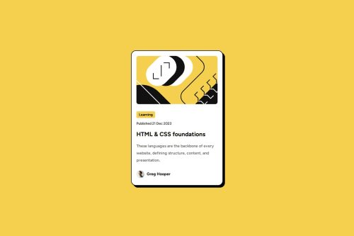
Responsive Card Blog HTML CSS

Solution retrospective
This time I've learned from my mistake; now I know how to center it vertically and horizontally. It's close to the design; my problem now is putting too much time into every detail, and it slows my progress down.
What challenges did you encounter, and how did you overcome them?The responsiveness of the screen size in mobile view—to solve it, I've used media queries, and it doesn't have a smooth transition, but it works and resizes when max-width is triggered.
What specific areas of your project would you like help with?transition animation
Please log in to post a comment
Log in with GitHubCommunity feedback
- @sezm00
I read somewhere that using vw for image sizing and rem for font sizes are better for responsiveness, tho it is confusing to use. Moreover, you can use "root:" to have all the colors, font weights, and other parameters in a variable that you can reuse throughout your CSS.

Join our Discord community
Join thousands of Frontend Mentor community members taking the challenges, sharing resources, helping each other, and chatting about all things front-end!
Join our Discord