Skip to content
  • Unlock Pro
  • Log in with GitHub
Solution
Submitted 10 months ago

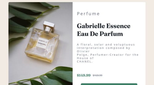
Responsive card for a product

react
Marcofa87•40
@Marcofa87
A solution to the Product preview card component challenge
View live sitePreview (opens in new tab)View codeCode (opens in new tab)

Solution retrospective


What challenges did you encounter, and how did you overcome them?

biggest challenge was to fit the font-size depending on the viewport

What specific areas of your project would you like help with?

understand better how to fit dinamically the content depending on viewport size

Code
Select a file

Please log in to post a comment

Log in with GitHub

Community feedback

  • Marcofa87•40
    @Marcofa87
    Posted 10 months ago

    Hello @ubcyukiny. Thank you for precious hints that you gave me.

  • P
    Ken•160
    @ubcyukiny
    Posted 10 months ago

    Hello,

    Good work on finishing the project!

    I have the figma design file, and I believe the width, height of the product-card is fixed, and so are the font-sizes.

    You could use percentage to configure the width and height. In the desktop design, the product image and the content are split into half. So you could do something like

    (Desktop version)

    .product-card {
      display: flex;
      flex-direction: row;
      width: 600px;
      height: 450px;
    }
    
    .product-img {
      width: 50%; /* 300px of the 600px width */
      height: 100%; /* Full height of the card */
    }
    
    .product-content {
      width: 50%; /* 300px of the 600px width */
      height: 100%; /* Full height of the card */
      display: flex;
      flex-direction: column; 
    }


    This ensures the image and the content will be split equally in width and height.

    In your index.css, you defined if screen width is >= 1024 px, display the desktop version:

    @media (min-width: 1024px) {
      .grid-container {
        display: flex;
        border-radius: 10px;
        font-size: clamp(1rem, 1rem + 0.8vw, 3rem);
      }
    }
    

    But in your product-card.tsx, you had a different min-width here

            <picture>
              <source media="(min-width: 768px)" srcSet={imagePerfumDesktop} />
              <img src={imagePerfumMobile} alt="perfum image" />
            </picture>
    

    So between 768 and 1024px, the page will be in mobile design, but the picture will be in desktop format. You could update these values to make the display more consistent.

    The body font seems different than the design, I think you missed an import in index.css. You only imported Fraunces but not Montserrat.

    Another minor thing that is different than the deisng is your ribbon text "PERFUME". You could use text-transformation: uppercase or just change the text.

Join our Discord community

Join thousands of Frontend Mentor community members taking the challenges, sharing resources, helping each other, and chatting about all things front-end!

Join our Discord
Frontend Mentor logo

Stay up to datewith new challenges, featured solutions, selected articles, and our latest news

Frontend Mentor

  • Unlock Pro
  • Contact us
  • FAQs
  • Become a partner

Explore

  • Learning paths
  • Challenges
  • Solutions
  • Articles

Community

  • Discord
  • Guidelines

For companies

  • Hire developers
  • Train developers
© Frontend Mentor 2019 - 2025
  • Terms
  • Cookie Policy
  • Privacy Policy
  • License

Oops! 😬

You need to be logged in before you can do that.

Log in with GitHub

Oops! 😬

You need to be logged in before you can do that.

Log in with GitHub

How does the accessibility report work?

When a solution is submitted, we use axe-core to run an automated audit of your code.

This picks out common accessibility issues like not using semantic HTML and not having proper heading hierarchies, among others.

This automated audit is fairly surface level, so we encourage to you review the project and code in more detail with accessibility best practices in mind.

How does the CSS report work?

When a solution is submitted, we use stylelint to run an automated check on the CSS code.

We've added some of our own linting rules based on recommended best practices. These rules are prefixed with frontend-mentor/ which you'll see at the top of each issue in the report.

The report will audit all CSS, SCSS and Less files in your repository.

How does the HTML validation report work?

When a solution is submitted, we use html-validate to run an automated check on the HTML code.

The report picks out common HTML issues such as not using headings within section elements and incorrect nesting of elements, among others.

Note that the report can pick up “invalid” attributes, which some frameworks automatically add to the HTML. These attributes are crucial for how the frameworks function, although they’re technically not valid HTML. As such, some projects can show up with many HTML validation errors, which are benign and are a necessary part of the framework.

How does the JavaScript validation report work?

When a solution is submitted, we use eslint to run an automated check on the JavaScript code.

The report picks out common JavaScript issues such as not using semicolons and using var instead of let or const, among others.

The report will audit all JS and JSX files in your repository. We currently do not support Typescript or other frontend frameworks.

Oops! 😬

You need to be logged in before you can do that.

Log in with GitHub

Oops! 😬

You need to be logged in before you can do that.

Log in with GitHub