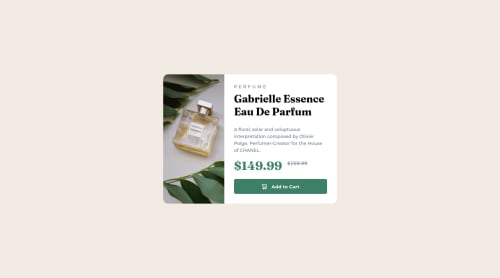
Responsive Card using CSS flex box

Solution retrospective
Suggestions are very welcome :)
Please log in to post a comment
Log in with GitHubCommunity feedback
- @correlucas
👾Hello again Vanessa =) , Congratulations on completing this challenge!
Your solution is fine but I have some suggestions to improve it even more:
1.THE PICTURE TAG is a shortcut to deal with the multiple images in this challenge. So you can use the
<picture>tag instead of importing this as an<img>or using a div withbackground-image. Use it to place the images and make the change between mobile and desktop, instead of using adivorimgand set the change in the css withdisplay: nonewith the tag picture is more practical and easy. Note that for SEO / search engine reasons isn’t a better practice import this product image with CSS since this will make it harder to the image. Manage both images inside the<picture>tag and use the html to code to set when the images should change setting the devicemax-widthdepending of the device desktop + mobile.Check the link for the official documentation for
<picture>in W3 SCHOOLS:https://www.w3schools.com/tags/tag_picture.asp2.The image is not responsive yet, a quick way to make any image responsive and respecting the container size is to add
display: blockandmax-width: 100%to the<img>selector. To improve the responsiveness even more adding the auto-crop property you can addobject-fit: coverto make the image crop inside the container its inside.img { display: block; object-fit: cover; max-width: 100%; }✌️ I hope this helps you and happy coding!
Marked as helpful - @Yavanha
Hello Vanessa
First of congratulation on completing this challenge you did really good
I reviewed your code and this is what I can see:
- Instead of doing the job by yourself to switch the image from the desktop to the mobile version use the picture element.
what you did : <img class="main-img desk-img" src="images/image-product-desktop.jpg" alt="perfume image"/> <img class="main-img mob-img" src="images/image-product-mobile.jpg" alt="perfume image"/> What you can do : <picture> <source srcset="images/image-product-mobile.jpg" media="(max-width: 599px)"> <source srcset="images/image-product-desktop.jpg" media="(min-width: 600px)"> <img class="main-img mob-img" src="images/image-product-mobile.jpg" alt="perfume image" /> </picture>- Try to make good use of the semantic html, for example in this challenge the article element would be a good fit:
what you did :
<main>
   ....
</main>

what you can do:

<main class="main-container">
 <section class="product-section">
  <h1>Title</h1>
  <article class="product-container">
      just an example
  </article>
</section>
</main>
Always question yourself if there is not already a meaninfull element that does the job. In other words an element that represents what I want to display better than a div or other meaninless elements.
- On the css side avoid pixels, use rem instead here a tricks to easily use rem by reseting the font-size of your html element to 62.5 % html element 62.5% font-size.
That's it, well done again and you need some in depth understanding, feel free to reply :)
Happy conding
Marked as helpful


Join our Discord community
Join thousands of Frontend Mentor community members taking the challenges, sharing resources, helping each other, and chatting about all things front-end!
Join our Discord