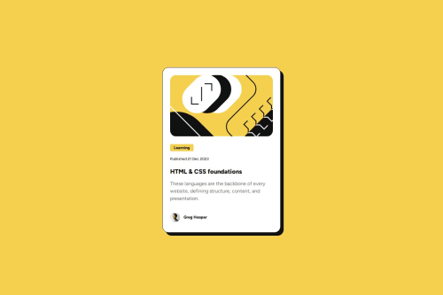
Submitted 10 months agoA solution to the Blog preview card challenge
Responsive card using min-max width
pure-css

@Darionvr
Solution retrospective
What are you most proud of, and what would you do differently next time?
This time I use tips given by other user's feedbacks on my previuos challenge. I use -grid- to center the card. And replace the -p- landmarks by H1, h2, etc. Also didn't make a mediaquery, instead I use min and max width.
What challenges did you encounter, and how did you overcome them?I started making the card as the -main- landmark taking care of the measures given by the Figma file, it was my first time using that program. It helped me when I had to create the text box below the image because every line have diferent style so I was no 100% sure on how to proceed but the Figma fila y very specific on what to do.
Code
Please log in to post a comment
Log in with GitHubCommunity feedback
- @mrdook0
.

Join our Discord community
Join thousands of Frontend Mentor community members taking the challenges, sharing resources, helping each other, and chatting about all things front-end!
Join our Discord