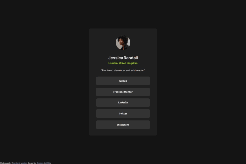
Responsive card with social link buttons

Solution retrospective
I am still not sure what the right strategy for the responsive card width/padding is. It seems to match up in the sizes from the designs but there might be a more elegant way (with clamp?) for those two properties.
Please log in to post a comment
Log in with GitHubCommunity feedback
- @0KAshish
Hello there 👋. Great job on building the Social Links Profile card!
You've done well applying layout and styling principles. Here's a quick review with some suggestions to improve your code:
-
🎯 Layout & Structure:
Your use of Flexbox and the centered.cardlayout is solid! Usingmargin: autowith a flex parent is a great way to center elements vertically. -
✨ Styling:
The color palette and hover effects are on point and responsive design is nicely handled with the media query. Great job using:rootfor design tokens!
🛠 Suggestions for improvement:
-
🔁 Use semantic HTML:
Consider using<a>tags for the social links instead of<button>. These are links to external sites, so semantically, anchor tags are more appropriate. -
🧹 Clean up unused rules:
Currently, all buttons are<button>elements but are functioning as links. Also, you may want to remove or rework the.attributionabsolute positioning if it causes overlap in smaller viewports. -
📱 Mobile tweaks:
You already have responsive padding on the card — nice! Just ensure that the layout doesn’t get too squished on smaller devices (e.g., padding around buttons can be reduced slightly if needed).
Overall, this is a clean and solid solution. With just a few semantic improvements, it’ll be even better! 🚀
Happy coding! 😊
Marked as helpful -
- @friedmantech
Great work, just the footer is stuck in the bottom left - its size seems to be limited to its text and is therefore not centering...


Join our Discord community
Join thousands of Frontend Mentor community members taking the challenges, sharing resources, helping each other, and chatting about all things front-end!
Join our Discord