Responsive cards with Grid, pseudo-elements, BEM and accessible colors

Solution retrospective
Hi, everyone! 👋🏻
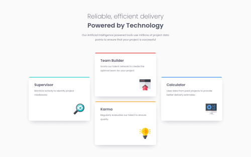
In this challenge, I practiced using Grid to implement this interesting layout.
I used a pseudo-element to create the colored top edge of the cards, and setting the color with a custom property that is altered by modifier classes makes it easy to create new cards with different colors.
The paragraph color in my solution is a bit darker to ensure it has enough contrast with the background, thus improving accessibility.
I found it difficult to match the box-shadow of the cards in the design; the one in my solution looks a bit different. It was my first attempt at using layered box-shadows, and I've linked two useful articles about this in the repository's README.
Any feedback, comments and suggestions are very welcome and appreciated. Thank you!
Please log in to post a comment
Log in with GitHubCommunity feedback
- @correlucas
👾Fala Julio, tudo bem? Parabéns pelo desafio!
Outra solução excelente como sempre, cara a responsividade ficou animal, eu gosto que o icone de cada card fica escalando e quando parece que ele vai sumir o layout vira mobile. Ficou muito bom mesmo. Dá pra melhorar (provavelmente vc ja sabe) mas eu substituiria a div dos cards com uma
section.Outra solução quase
pixel perfect, como te falei no outro desafio, ficou quase perfeita, se vc quiser perseguir opixel perfectnem precisaria do arquivo do Figma, da pra usar uma extensao do Google Chrome chamadapixel perfectque ela faz um overlay do seu site com um jpeg do desafio por baixo ai vc pode construir tudo por cima desse jpeg pra acertar o padding e o tamanho dos elementos. O bom de ter a conta premium é pq vc pode modificar os arquivos do Figma pra personalizar a solução e nem tem que pensar em design, tamanho de container e etc, da pra focar só em codar, isso é a melhor coisa e te digo que vale mto a pena.Outra coisa é que vc pode usar um software tipo photoshop ou figma e usar um retangulo pra medir tudo, é uma alternativa tbm kkkkk
To vendo que vc tá começando a usar
gridcom mais frequência, aqui um resource mto bom pra layouts de GRID: https://gridbyexample.com/examples/Os exemplos desse site são ótimos e vc vai aprender mto sobre layout lá.
👋 Espero ter ajudado e continue no foco!
Marked as helpful - @AdrianoEscarabote
Ola Julio, tudo bem?
Você realizou um bom trabalho neste desafio. Realmente conseguiu deixar o seu layout quase idêntico ao do exemplo, parabéns.
Gostei bastante do modo que você fez a responsividade, fiz um pouco um diferente, mas confesso que a sua está ótima. É sempre bem difícil acertar perfeitamente a box-shadow ahuahauh eles poderiam colocar no readme, considerando que não é nada tão difícil de fazer, mas sim, que pode variar bastante.
Parabéns pelo desafio bro.


Join our Discord community
Join thousands of Frontend Mentor community members taking the challenges, sharing resources, helping each other, and chatting about all things front-end!
Join our Discord