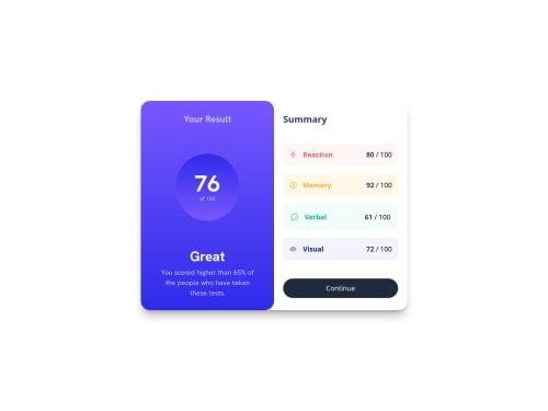
Responsive Component, Flexbox, Grid, skeumorphism design.

Solution retrospective
I'm proud of the continue button that hovers with a color that matches the aesthetic and feel of the component. I would take a mobile-first approach next time, and use more complex technologies like React to build a reusable component that could be implemented in future projects.
What challenges did you encounter, and how did you overcome them?The container that holds the results and summary data needed to have dimensions that needs to be split in half, to share between both, so I needed to make one big component in this case the summary, and the results container needs to be half the size and sit next to each other. I used flexbox for that, and using its default flex-direction property allowed me to do just that. This way it can also add responsiveness to the component to switch from row to column for its flex-direction property in a smaller screen.
What specific areas of your project would you like help with?I would like some tips and advice for building responsive components that look good on all devices. My component looks good on small devices with large screen but not smaller screens. The user needs to scroll down to view the "Continue" button.
Please log in to post a comment
Log in with GitHubCommunity feedback
No feedback yet. Be the first to give feedback on Luis Rosas's solution.
Join our Discord community
Join thousands of Frontend Mentor community members taking the challenges, sharing resources, helping each other, and chatting about all things front-end!
Join our Discord