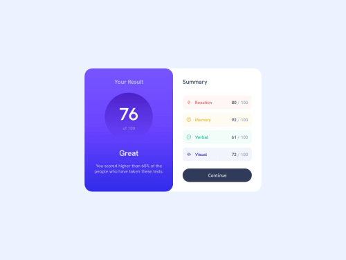
Submitted 10 months agoA solution to the Results summary component challenge
Responsive Component using flex box & media queries
sass/scss

@underhr
Solution retrospective
What are you most proud of, and what would you do differently next time?
I'm most proud of using SCSS during this project, as this was my first time. I definitely got a bit carried away using the nesting feature, so I'm looking forward to learning how to use that efficiently without making my code confusing.
What specific areas of your project would you like help with?As usual, any input on how I can improve my code, make it cleaner, any ways I could have done anything more efficient!
Code
Loading...
Please log in to post a comment
Log in with GitHubCommunity feedback
No feedback yet. Be the first to give feedback on Haley Underwood's solution.
Join our Discord community
Join thousands of Frontend Mentor community members taking the challenges, sharing resources, helping each other, and chatting about all things front-end!
Join our Discord