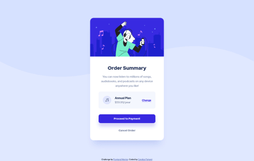
Submitted over 3 years agoA solution to the Order summary component challenge
Responsive component using Sass and Flexbox
sass/scss

@Candyfair
Solution retrospective
Here is my solution for this challenge. I still have a few questions though:
- Are there better ways to organise the HTML code in the "Annual plan" block than using lots of divs and Flexbox?
- I used a media query for the mobile version, what would be the recommended max-width for the screen size for mobile devices?
Many thanks for your feedback!
Code
Please log in to post a comment
Log in with GitHubCommunity feedback
- Account deleted
recomendo dar uma olhada no site do bem - https://en.bem.info/ - para sanar sua idéia sobre as divs extras.
obs: seria melhor substituir a div por uma section ou um article, ...faz mais sentido.
Marked as helpful - @MatthewT95
You could look into css grid for the plan section instead of flexbox.
Marked as helpful

Join our Discord community
Join thousands of Frontend Mentor community members taking the challenges, sharing resources, helping each other, and chatting about all things front-end!
Join our Discord