Responsive contact card HTML, CSS, JS

Solution retrospective
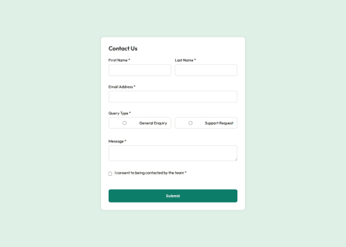
I’m most proud of how clean and responsive the final form design turned out, especially aligning all elements correctly and ensuring accessibility with proper labels, and error messages. Next time, I would organize my CSS earlier and structure reusable classes to avoid repeated styling and make tweaks more efficient.
What challenges did you encounter, and how did you overcome them?The radio buttons and checkbox label text were particularly difficult to align, the text kept wrapping, I struggled getting them to sit on one line and align to the left. It too some time to get the required precise flex and spacing adjustments. I also struggled with changes not appearing in the browser despite updating the CSS, which turned out to be an issue with how files were linked and sometimes cached. Checking file structure and using consistent class naming helped resolve that.
What specific areas of your project would you like help with?I'd appreciate feedback on: Form layout edge cases: Does the design hold up well on smaller screens or when zoomed? Code cleanliness: Are there any redundant styles or better practices I could use in the CSS?
Please log in to post a comment
Log in with GitHubCommunity feedback
No feedback yet. Be the first to give feedback on Angelina Faggiano's solution.
Join our Discord community
Join thousands of Frontend Mentor community members taking the challenges, sharing resources, helping each other, and chatting about all things front-end!
Join our Discord