Responsive Contact Form Solution | Frontend Mentor Challenge |

Solution retrospective
What I’m Most Proud Of: I'm really proud of how I was able to create a clean, responsive, and functional contact form using just HTML and CSS. The challenge was a great opportunity for me to practice working with mobile-first design principles, ensuring that the form looks and works well on all screen sizes—from mobile phones to desktops.
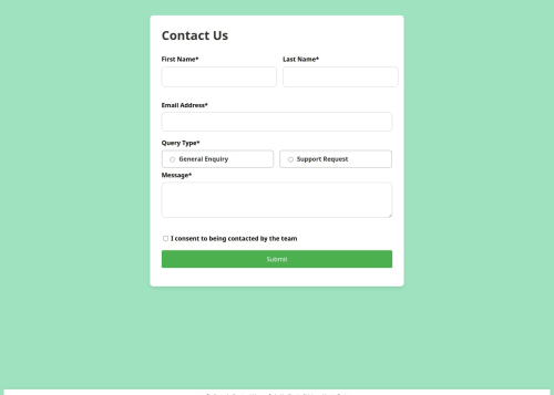
Additionally, I’m happy with the user-friendly experience I’ve provided. The form is simple to navigate, with clear input fields, labels, and radio buttons, and a straightforward submit process. I also made sure to include a success message that appears after form submission, giving users immediate feedback that their message has been sent.
Another aspect I’m proud of is that I used GitHub Pages for hosting. It was a great chance to practice deploying a static site and giving others access to the live version directly from GitHub. Sharing a live version of the project with others is a nice touch and provides real-world value to a simple HTML form.
What I Would Do Differently Next Time: While I’m happy with the project overall, there are a few things I would do differently next time:
Form Validation with JavaScript: Right now, the form relies purely on the front-end HTML and CSS, and I haven’t implemented form validation to check if the user has filled in all the required fields correctly (like ensuring the email is in the right format). I would add JavaScript validation to provide better user feedback and ensure the form submission is only completed if the data is correct.
Better Accessibility Features: Although the form is functional, there are areas where I could improve accessibility. For example, I could add ARIA attributes to improve screen reader compatibility, and ensure the form is fully navigable by keyboard. Next time, I’ll pay closer attention to accessibility by adding labels, roles, and ensuring a fully accessible design.
Responsive Design Enhancements: While the form is mobile-first, there are some small visual improvements I could make on larger screens, such as adjusting the spacing, button size, or the overall layout. I’d like to use more advanced CSS Grid or Flexbox layouts to improve the responsiveness and visual balance on larger displays.
Adding a Backend Simulation: Since the form is just for front-end display, it doesn’t actually submit any data. In future iterations, I’d consider either using a backend service (like Netlify Functions, Firebase, or Formspree) to handle form submissions, or at least simulate form submission with some JavaScript to show how a live system would interact with the data.
These are just a few ideas for areas of improvement, but overall, I’m happy with how the project turned out. With these enhancements, I could make the form more interactive, accessible, and feature-complete.
What challenges did you encounter, and how did you overcome them?- Creating a Fully Responsive Layout Challenge: One of the primary challenges I faced was ensuring the contact form was fully responsive, especially for mobile devices. Since the form needs to work well across all screen sizes (mobile, tablet, desktop), I had to pay close attention to how each element scales and repositions itself when the viewport size changes.
How I Overcame It: I approached this challenge using mobile-first design principles. I began by designing the layout for smaller screens and then progressively enhanced it for larger screens using CSS media queries. For example, I used Flexbox to ensure the form fields aligned correctly and resized in a way that looked good on both small and large screens. I also made sure that padding and margins were adjusted for different screen sizes to avoid overcrowding or too much space between elements. Testing the form on multiple devices and screen sizes helped me fine-tune the layout.
- Ensuring Form Accessibility and Usability Challenge: While building the form, I realized that it was not as accessible as it could be. There were no ARIA attributes for screen readers, and the form didn't have full keyboard navigation support, which could be a barrier for users with disabilities.
How I Overcame It: I researched and made improvements by ensuring that all form fields had proper label elements with for attributes, linking them to the respective form fields. This makes the form more accessible for screen readers. I also ensured that users could tab through the form fields using keyboard navigation. While I didn’t implement full ARIA roles for this challenge, I’ve learned that accessibility should be a priority, and I plan to implement ARIA attributes in future iterations to further improve usability.
- Making the Success Message Dynamic Challenge: The success message that appears after the form is submitted was static and didn’t actually display based on form submission, as I had no backend or JavaScript in place for handling the actual form data. This created a gap in interactivity, as I couldn’t dynamically show the success message when a user pressed the submit button.
How I Overcame It: To make the success message appear dynamically, I used a simple JavaScript solution to show the success message when the user clicks the submit button. I added a click event listener to the submit button, which triggered the display of the success message, simulating what would happen if the form were connected to a backend system. While this isn't a full solution (since it doesn't handle actual form submission), it gave me a good opportunity to practice adding interactivity to static pages.
- Handling Styling for Different Form Elements Challenge: Another challenge I encountered was styling form elements like radio buttons, checkboxes, and text areas to ensure they looked consistent across all browsers. These form controls can sometimes have different default styles depending on the browser, making it difficult to create a unified look.
How I Overcame It: To address this, I used CSS resets to standardize the appearance of form elements across different browsers. I then applied custom styles to radio buttons and checkboxes using pseudo-elements and labels to create a more consistent, visually appealing design. For example, I styled the radio buttons to make them larger and easier to click, while also ensuring that the labels were clear and easy to read.
- Deploying the Project Using GitHub Pages Challenge: The deployment process was a bit tricky at first. While I was familiar with Git and GitHub, I hadn’t worked with GitHub Pages before, and I wasn’t sure how to set up the repository for hosting the project live.
How I Overcame It: I followed the official GitHub Pages documentation to set up hosting. The main issue was figuring out the correct branch and folder to use, as my repository was relatively new. Once I selected the main branch and set the root folder for GitHub Pages, the process became much smoother. The deployment took a few minutes to propagate, but once everything was set up, the live version of the site worked perfectly.
Conclusion These challenges helped me learn a lot, from ensuring responsiveness across devices to improving accessibility and interactivity. Each challenge was a valuable opportunity to practice new skills and refine my approach. Moving forward, I’ll continue to focus on improving accessibility, adding JavaScript functionality, and polishing the design to create even better user experiences.
What specific areas of your project would you like help with?- JavaScript Form Validation While the form works well in terms of design, I haven't implemented any form validation yet. I'd love to get help or suggestions on how to approach client-side form validation using JavaScript. Specifically, I need guidance on:
Ensuring the email input field is correctly validated (e.g., proper email format). Enforcing that all required fields (First Name, Last Name, Message) are filled before submission. Displaying appropriate error messages if a field is invalid or missing. I’d appreciate advice on best practices for writing clean and efficient validation scripts, as well as how to trigger error messages in a way that doesn't disrupt the user experience.
- Improving Accessibility Although I’ve added basic labels for the form fields, I’d like to improve the accessibility of the form. Specifically, I’m interested in:
Adding ARIA attributes (such as aria-labelledby, aria-describedby, etc.) to make the form more accessible to screen readers. Ensuring that the form is fully keyboard navigable, especially for users relying on tabbing to move through fields. Making sure that all interactive elements (buttons, checkboxes, etc.) are properly labeled and accessible for users with visual impairments. Any advice or resources on how to make my form more accessible would be greatly appreciated!
- Improving the Visual Design of Form Elements While the form layout is functional, some of the form elements (like radio buttons and checkboxes) don’t have the most modern or polished look. I’d love help with:
Customizing form controls (radio buttons, checkboxes) to make them look consistent across different browsers and devices. Using CSS to make the form visually engaging while still being simple and user-friendly. Suggestions for enhancing the typography, button styling, or any other visual elements to improve the overall user interface. 4. Dynamic Form Submission Handling (without Backend) Currently, I have no backend to process the form submission, and the success message is just a placeholder. I’d like to:
Learn how to simulate a form submission using JavaScript and show a dynamic success message without a real backend. Alternatively, if there’s a way to set up a simple service like Formspree or Netlify Forms to handle the submission without needing a full backend, I’d appreciate guidance on how to set this up. Any help in connecting the form to a real-world form handler or even simulating submission would be fantastic!
- Best Practices for Code Organization The HTML and CSS are relatively straightforward, but I want to make sure my code is as clean and maintainable as possible. I’d appreciate any advice on:
Organizing the CSS—should I use a CSS framework like Flexbox or CSS Grid more effectively? Should I consider separating the styles for mobile and desktop? Improving the overall HTML structure to make it more modular or semantic. Any best practices for naming conventions or file structure to make the project scalable if I decide to add more features in the future. Conclusion While I'm proud of the progress I’ve made with this project, I’m looking to improve both the functionality and the user experience. Any help, resources, or advice on these areas would be highly appreciated as I continue to learn and refine my skills!
Please log in to post a comment
Log in with GitHubCommunity feedback
No feedback yet. Be the first to give feedback on sicario’s solution.
Join our Discord community
Join thousands of Frontend Mentor community members taking the challenges, sharing resources, helping each other, and chatting about all things front-end!
Join our Discord