Responsive css and some flex box

Solution retrospective
This my first challenge its easy I finish the challenge in about 30 minutes
Please log in to post a comment
Log in with GitHubCommunity feedback
- @MelvinAguilar
Hello there 👋. Good job on completing the challenge !
I have other suggestions about your code that might interest you.
HTML 📄:
- Use semantic elements such as
<main>and<footer>to improve accessibility and organization of your page.
Alt text 📷:
-
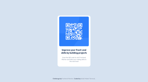
To make the alt attribute as useful and effective as possible, avoid using words such as "image", "photo", or "picture" as they are redundant because the image tag already conveys that information. Instead, try to make the description as human-readable and understandable as possible. The alt attribute should explain the purpose of the image, for example, in the case of a QR code, a description like "qr code to frontendmentor.io" would be more appropriate.
If you want to learn more about the
altattribute, you can read this article. 📘.
CSS 🎨:
- Centering an element with
position: absolutewould make your element behave strangely on some screen sizes, "there's a chance the content will grow to overflow the parent". You can use Flexbox or Grid to center your element. You can read more about centering in CSS here 📘.
I hope you find it useful! 😄 Above all, the solution you submitted is great!
Happy coding!
Marked as helpful - Use semantic elements such as
- @Hassiai
Replace<div class="container">with the main tag, <h2> with <h1> and <div class="attribution"> with the footer tag to fix the accessibility issues. click here for more on web-accessibility and semantic html
Replace the height in .container with a padding value for all the sides, this will prevent the content from overflowing on smaller screens and its a responsive replacement.
padding: 15pxGive the img a max-width of 100% instead of a width and height value.Give h1 and p the same font-size of 15px and the same margin-left, margin-right and margin-top values. Give p a margin bottom value.
Use relative units like rem or em as unit for the padding, margin, width values and preferably rem for the font-size values, instead of using px which is an absolute unit. For more on CSS units Click here
Hope am helpful.
Well done for completing this challenge. HAPPY CODING
Marked as helpful


Join our Discord community
Join thousands of Frontend Mentor community members taking the challenges, sharing resources, helping each other, and chatting about all things front-end!
Join our Discord