Not Found
Not Found
Not Found
Not Found
Not Found
Not Found
Not Found
Not Found
Not Found
Not Found
Not Found
Not Found
Not Found
Not Found
Not Found
Not Found
Not Found
Not Found
Not Found
Not Found

Submitted

Responsive CSS Flexbox & CSS Grid Profile Card Component
Bhoami K Khona• 330

@bhoamikhona

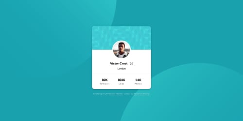
Desktop design screenshot for the Profile card component coding challenge

This is a solution for...

  • HTML
  • CSS
1newbie
View challenge

Design comparison


SolutionDesign

Solution retrospective


This is my solution for the Profile card component coding challenge

Links

  • Solution URL: Link
  • Live Site URL: Link

Built with

  • Semantic HTML5
  • CSS
  • CSS Flexbox
  • CSS Grid

Any suggestions for improvement are welcomed.

Community feedback

Kay• 110

@kayy-w

Posted

Hey! Your solution is really awesome, I absolutely love the rollover with the increased drop shadow. This is a nice little touch. My only suggestions would be to:

  1. Possibly cut the <div class="pattern-background">, you could put the background on the main card itself, saving some html coding. You could also consider using flex for this top half of the card as well as the info section below.
  2. Consider using a border rather than a <hr>, just to make the html more succinct.
  3. You could cut down on the amount of p tags inside <div class="statistics">, you use six in total but you could use three with either a <strong> or a <span> to style the numbers. This may make your code more semantically correct as well.

Really awesome solution, it looks almost identical to the design and I do love the added touch of the rollover. Congrats! 🙌

Marked as helpful

1

Bhoami K Khona• 330

@bhoamikhona

Posted

Hi, @kayy-w

Thank you for your suggestions as well as compliments. I appreciate it.

For div.pattern-background, it has two purposes. One of them is the obvious, displaying the pattern image but, the other one is being the relative parent container for the absolutely placed avatar image. This div makes it easier for me to place the avatar and if I place the background directly on the card, sure it may lessen a couple of lines of HTML code but, it will considerably increase the amount of CSS code to create the same layout again. Other than that, the rest of the cards margin is also dependent on that div.

About the hr and decreasing the number of p elements. I will come back to this challenge at a later date and fix as I have already moved on to the next one. However, I will keep your suggestions in mind for the next time I have to build something similar.

I appreciate you taking time and writing these suggestions.

Thank you!

1
P
Andreas Remdt• 950

@andreasremdt

Posted

Hey @bhoamikhona,

Nice job finishing this challenge. I really like how close it is to the design and what you did with the hover effect! Also, your HTML and CSS look good. I only have a couple of minor suggestions:

  • Your div.pattern-background, which you used for the pattern background and profile image, has a role of img and an aria-label. I don't think you need this. How I see it, the background pattern is purely for visual purposes and has no importance to screen readers or search engines whatsoever, meaning that you can remove the role and aria-label. Besides, the img element inside has a role of img by default, which would make this markup incorrect as images can't contain other images.
  • The stats section could confuse screen reader users, because it will read something like "80K 803K 1.4K Followers Likes Photos" instead of "80K Followers, 803K Likes...". Plus, 3 paragraphs should be enough. Most screen readers announce that there's a paragraph, making it extra confusing. Hence I suggest the following structure:
<p>
  <span class="stat">80K</span>
  Followers
</p>
<p>
  <span class="stat">803K</span>
  Likes
</p>

Using CSS, you can then lay it out properly, for example with Flexbox.

Hope my comments help you, let me know if you have any questions. Happy coding!

Marked as helpful

1

Bhoami K Khona• 330

@bhoamikhona

Posted

@andreasremdt

Hi,

Thank you for your suggestions. They were helpful. I removed the aria-label and role attributes from div.pattern-background.

Moreover, I like the solution you provided for the stats section but, I instead re-arranged the HTML file flow according to how it is supposed to be and just replaced grid cell placements using CSS. You can checkout my updated solution here: Link

Please let me know what you think about it and if you have any more recommendations.

Thank you!

1
P
Andreas Remdt• 950

@andreasremdt

Posted

@bhoamikhona

Hey, it is looking better already! And while the order of your paragraphs makes more sense now, I would still advise you to change it to only 3 paragraphs.

The way I see it, a stats number and label are coupled together, as if you wrote "I have 80K followers.". You wouldn't write "I have 80K"

"followers."

That's why my proposed structure contains 1 paragraph for each stats couple, and a span for styling purposes only, since there's no semantic meaning to a span. This way, it's clear that the 80K refers to your followers and vice-versa.

In the end, your changes made your solution much better and it's up to you - as always in programming, there're a thousand ways to get to the finish line, and mine is just a suggestion. Others might use totally different markup, such as ul or dl. I'll leave it up to you :-)

Let me know if you have any further questions, happy to help!

Marked as helpful

2
Bhoami K Khona• 330

@bhoamikhona

Posted

Hi, @andreasremdt

Thank you for your suggestion and I feel like you are right about how a user would read "I have 80K followers." and not "I have 80K"

"followers."

I will come back to this challenge at a later date and fix it but, as of right now, I have already moved on to the next one. However, I will keep this in mind the next time I build something like this and build that project accordingly.

Thank you!

0

Please log in to post a comment

Log in with GitHub
Discord logo

Join our Discord community

Join thousands of Frontend Mentor community members taking the challenges, sharing resources, helping each other, and chatting about all things front-end!

Join our Discord