@zeerobit
Posted
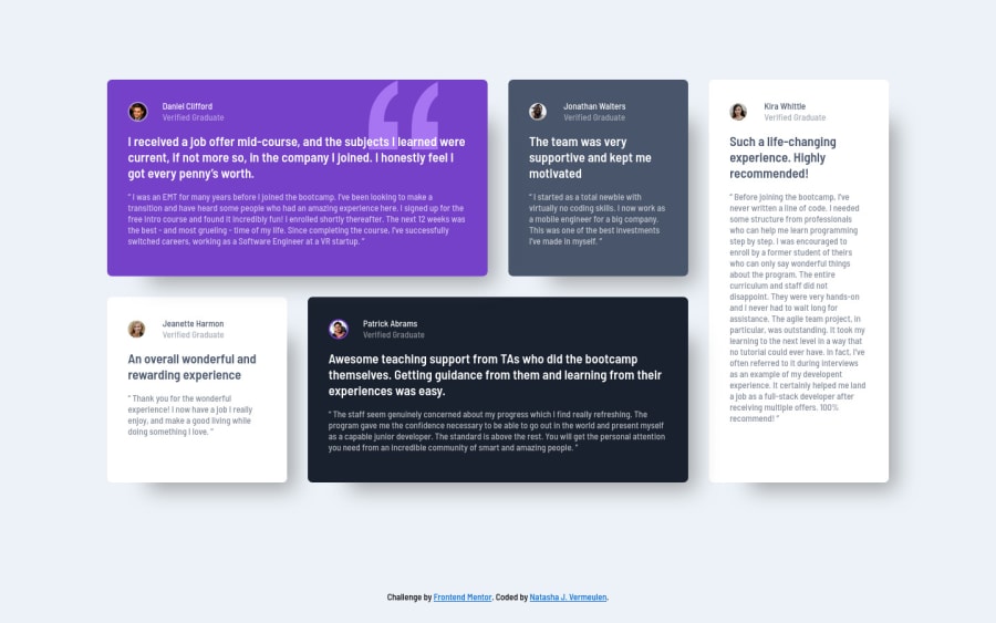
Good work completing this challenge. Your grid template columns value is what's causing the issue you're having, here are a few pointers:
- change
grid-template-columns: repeat(auto-fit, minmax(240px, 1fr));
to `grid-template-columns: repeat (4, 1fr); - to center your grid properly remove
margin: 8vw 0;
from .grid then from your .content class changejustify-content: space-between;
tojustify-content: center;
- Add this to your media query to fix your layout for mobile:
.grid {
grid-template-columns: 1fr;
}
#Daniel {
grid-column: 1;
}
#Patrick {
grid-column: 1;
}
#Kira {
order: 2;
}
- As suggested by Dev, to fix the accessibility issue, replace the div element for your content class to main, also wrap the attribution section in a footer
- It'd be much easier to build this layout using grid area, here is a grid area tutorial check it out
- use rem instead of px since px is not scalable
- for this type of testimonial card design, the proper html semantics to use would be
figure
to wrap the content of each card,figcaption
to wrap the names, title andblockquote
to wrap the paragraphs. You can read more about it here - Replace the h4 tags to p since they're paragraphs and not headlines
- Adding a css reset can prevent weird browser behavior, i use this one
Hope you find these helpful, happy coding!!!