Responsive CSS3 using CSS Grid and Flex-box

Solution retrospective
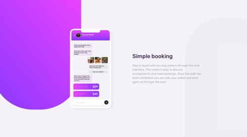
So this one was pretty difficult despite not needing JavaScript. The trial and error was immense and yet I still couldn't quite nail it completely. :') This truly was a test of my HTML & CSS skills and cannot wait to improve on them more. I am happy that I was able to add some responsiveness, however it was not like how I wanted. My question for you guy's is:
How can I get the gap issue between the phone and the paragraph to act properly?
Also, I am not sure about how I can gain access to the icons for the "type a message" box and for the phone. Was there an update to this website where nobody gets those icons added to the files they download? I tried using iconfinder and fontawesome, however I do not have a pro account and even when I tried downloading the small versions of the free ones, they came full sized. I know I can add them via HTML, but that becomes cumbersome and I like trying to keep my HTML as short as possible. You know, unless I get into a nesting frenzy like this project. :'D
I tried a lot of different things and I feel that the HTML nesting is pretty much entirely at fault in this project.
Thank you very much for taking the time to look through my project and I look forward to getting as much feedback as I can get. It truly is appreciated!!! <3
Please log in to post a comment
Log in with GitHubCommunity feedback
No feedback yet. Be the first to give feedback on lrobb95's solution.
Join our Discord community
Join thousands of Frontend Mentor community members taking the challenges, sharing resources, helping each other, and chatting about all things front-end!
Join our Discord