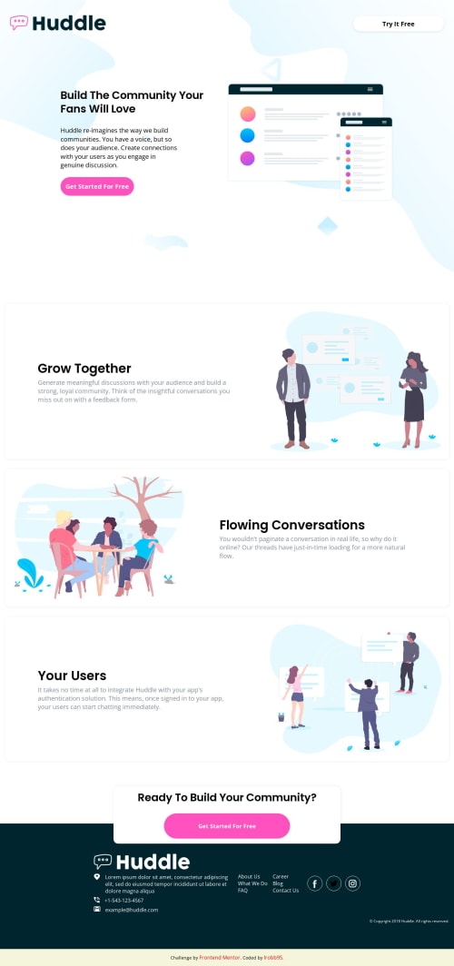
Responsive CSS3 using CSS Grid, Flex, and clamp()

Solution retrospective
Well, it's not perfect by any means, but I have put quite some time into this project and have a functioning version.
The area where I found most challenging was the spacing between the header and the main content. As the screen size shrunk, it kept lifting up so I had to do a hacky solution in order to fix that issue. Also, the footer was difficult too as far as the proper spacing is concerned. I ended up just centering it on the footer and then put space-between inside the container that holds the content.
On top of best practices, does anybody have any tips on how I can make these two areas look nicer?
Thank you very much for your input and looking into my project!
- L
Please log in to post a comment
Log in with GitHubCommunity feedback
No feedback yet. Be the first to give feedback on lrobb95's solution.
Join our Discord community
Join thousands of Frontend Mentor community members taking the challenges, sharing resources, helping each other, and chatting about all things front-end!
Join our Discord