Skip to content
  • Unlock Pro
  • Log in with GitHub
Solution
Submitted almost 3 years ago

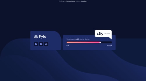
Responsive data storage component

Nader•300
@youtubbeh
A solution to the Fylo data storage component challenge
View live sitePreview (opens in new tab)View codeCode (opens in new tab)

Solution retrospective


I tried to make it so the content on the right side reduced its width progressively instead of changing abruptly, but couldn't do it. I tried all sorts of width and max-width values, as well as flex-shrink.

If you have any advice on how to do it, I'd be very thankful!

Code
Select a file

Please log in to post a comment

Log in with GitHub

Community feedback

  • Gloryjaw•320
    @Gloryjaw
    Posted almost 3 years ago

    Hii, nice work on the challenge. It looks awesome.The few things you can do to make it look like the original design is -->

    1. You should use width in percentages instead of px to make change in widths progressively. Using width in percentage will adjust the width relative to its parent. So,width:75% means 75% of the parent width.

    2. Border radius of the GB left popup in desktop screen is little more than it should be, reduce it.

    3. Try to make your html code a little semantic.(using section, buttons tags instead of div).

    Marked as helpful

Join our Discord community

Join thousands of Frontend Mentor community members taking the challenges, sharing resources, helping each other, and chatting about all things front-end!

Join our Discord
Frontend Mentor logo

Stay up to datewith new challenges, featured solutions, selected articles, and our latest news

Frontend Mentor

  • Unlock Pro
  • Contact us
  • FAQs
  • Become a partner

Explore

  • Learning paths
  • Challenges
  • Solutions
  • Articles

Community

  • Discord
  • Guidelines

For companies

  • Hire developers
  • Train developers
© Frontend Mentor 2019 - 2025
  • Terms
  • Cookie Policy
  • Privacy Policy
  • License

Oops! 😬

You need to be logged in before you can do that.

Log in with GitHub

Oops! 😬

You need to be logged in before you can do that.

Log in with GitHub

How does the accessibility report work?

When a solution is submitted, we use axe-core to run an automated audit of your code.

This picks out common accessibility issues like not using semantic HTML and not having proper heading hierarchies, among others.

This automated audit is fairly surface level, so we encourage to you review the project and code in more detail with accessibility best practices in mind.

How does the CSS report work?

When a solution is submitted, we use stylelint to run an automated check on the CSS code.

We've added some of our own linting rules based on recommended best practices. These rules are prefixed with frontend-mentor/ which you'll see at the top of each issue in the report.

The report will audit 1st-party linked stylesheets, and styles within <style> tags.

How does the HTML validation report work?

When a solution is submitted, we use html-validate to run an automated check on the HTML code.

The report picks out common HTML issues such as not using headings within section elements and incorrect nesting of elements, among others.

Note that the report can pick up “invalid” attributes, which some frameworks automatically add to the HTML. These attributes are crucial for how the frameworks function, although they’re technically not valid HTML. As such, some projects can show up with many HTML validation errors, which are benign and are a necessary part of the framework.

Oops! 😬

You need to be logged in before you can do that.

Log in with GitHub