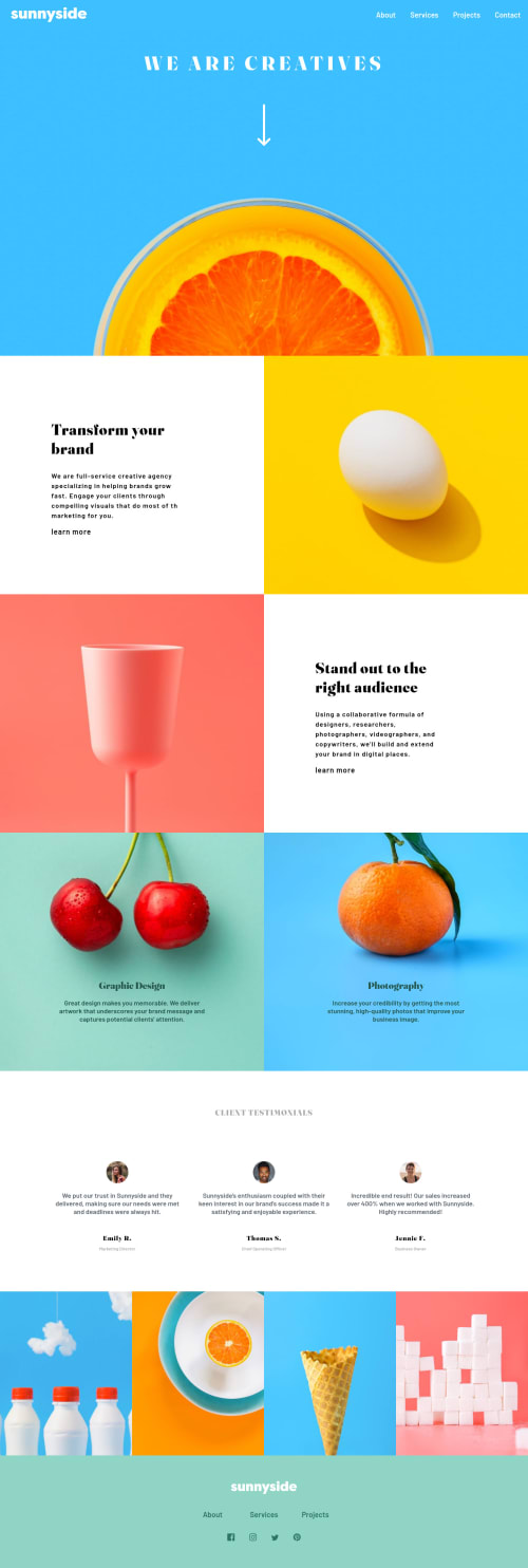
Submitted almost 3 years agoA solution to the Agency landing page challenge
Responsive design

@mitulpatel224
Solution retrospective
This is my first time working with flex, media query. Please provide your suggestions. I want to understand the setting <img> tag's "srcset" attribute for different resolutions. Will it be able to load different images for desktop and mobile size devices?
Code
Loading...
Please log in to post a comment
Log in with GitHubCommunity feedback
No feedback yet. Be the first to give feedback on mitul's solution.
Join our Discord community
Join thousands of Frontend Mentor community members taking the challenges, sharing resources, helping each other, and chatting about all things front-end!
Join our Discord