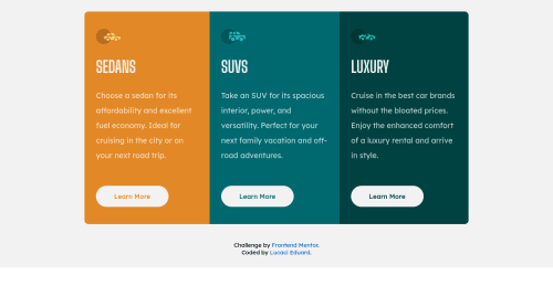
Responsive design

Please log in to post a comment
Log in with GitHubCommunity feedback
- @correlucas
👾 Hello Eduard, congratulations for your solution!
Your solution seems fine looking the design part, all the colors are okay, you've set the media query to change the container flow. There's only two minor fixes for your solution, change the background position and give a better alignment to the component thats not aligned to the screen center.
👾 Here's my tips:
1.The background-color should be add to the body, you've add to the container, so this means that the background will behave following the container properties, to have it filling all the screen delete the property from .container and add it the
body.2.Once you change the background-color position, now you need to give a height size to the body and set its alignment using flexbox. Add
display: flex;and the alignment properties and alsomin-height: 100vhto display 100% of the viewport height.3.Your component isn't fully responsive due the fact you've applied
widthinsteadmax-widthto your component size not allowing it to contract when the screen become smaller.I hope it helps you and happy coding bro!
👾 See the code for the fixes I've applied to your code:
body { display: flex; min-height: 100vh; align-items: center; justify-content: center; background-color: hsl(0, 0%, 95%); } .container { display: flex; align-items: center; /* justify-content: center; */ flex-direction: column; max-width: 100%; /* background-color: hsl(0, 0%, 95%); */ }Marked as helpful

Join our Discord community
Join thousands of Frontend Mentor community members taking the challenges, sharing resources, helping each other, and chatting about all things front-end!
Join our Discord