Responsive design

Please log in to post a comment
Log in with GitHubCommunity feedback
- P@Babyjenx
Nice work! This is pretty close, although the media queries don't seem to be having any effect.
There is a small gap at the bottom of the image. This can be fixed by using:
.card-image { display: flex; }
To get the card-image and card-content evenly taking up half of the card try:
.card-image { width: 50%; }
and
card-content { width: 50% }
The first media query you have is empty: @media (max-width: 23.44em) and (min-width: 90em) { }
It also won't work because 23.44em (375px) and 90em (1440px) never overlap. I'd suggest removing it.
Try replacing your media query with this:
@media only screen and (max-width: 600px) {
.card { display: flex; flex-direction: column; }
.card-image { width: 100%; }
.card-content { width: 100%; } }"
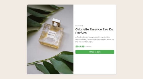
Lastly, "Gabrielle Essence Eau De Parfum" and "149.99" should be using, font-family: Fraunces;
Marked as helpful

Join our Discord community
Join thousands of Frontend Mentor community members taking the challenges, sharing resources, helping each other, and chatting about all things front-end!
Join our Discord