Not Found
Not Found
Not Found
Not Found
Not Found
Not Found
Not Found
Not Found
Not Found
Not Found
Not Found
Not Found
Not Found
Not Found
Not Found
Not Found
Not Found
Not Found
Not Found
Not Found

Submitted

Responsive design, grid, flex-box, custom variables,

#sass/scss
Ben 300

@BenChis

Desktop design screenshot for the E-commerce product page coding challenge

This is a solution for...

  • HTML
  • CSS
  • JS
3intermediate
View challenge

Design comparison


SolutionDesign

Solution retrospective


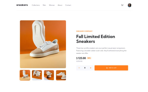
Hey there, Here is my solution for the product landing page. Please if you are interested in my experience reading my markdown.

Thanks for your everyone who want to spend some time giving me some feedback.

Community feedback

@molszewski34

Posted

Hey i see few problems.

Only first 2 menu links have hover effect. Hover effect can look better if you lower transition time. Cart when empty change side. I had the same problem and for me the best and easy solution was to make a container with button and sum visibility:hidden; Cart in mobile view has big white space. Plus and minus buttons are too small. You can make them small but it is a good thing to put them in span so area in which you can click is bigger. I didn't test it on smartphone but buttons can be hard to push. Same thing with slider buttons. Button in cart do not always hover when i move cursor. Input number should keep the value visible when submit.

Marked as helpful

0
Ben 300

@BenChis

Posted

Hey Mariusz, Thanks for checking out my solution! I saw the problem and fixed it. It occurred because I tried out some transition effect for the modal window and forgot to add back visibility:hidden, that why the modal window was partly invisible hiding the navbar. Thanks actually for the hover I did that on purpose, but you are right it might be a bit too slow :D. Yeah, especially with all dynamic data the span is a great element to use.

For the amount input number, I reset the number, because actually when you submit the data for the cart I thought it is a nice effect because the little span above the cart icon shows then the current amount you have already in the cart.

Have great day!

0

Please log in to post a comment

Log in with GitHub
Discord logo

Join our Discord community

Join thousands of Frontend Mentor community members taking the challenges, sharing resources, helping each other, and chatting about all things front-end!

Join our Discord