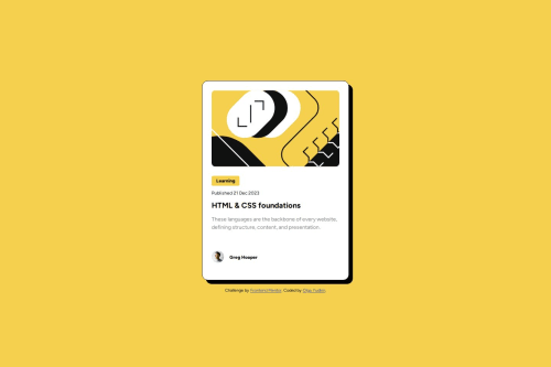
Responsive design of blog preview card

Solution retrospective
I was able to implement mobile-first approach to make the design responsive. I made the design as close to the original as possible and tried to use best practices for structuring my html, class names and using semantic tags where applicable.
What challenges did you encounter, and how did you overcome them?It took a while to figure out how to position an image inside a div and not to lose border radius. After extensive googling I found out that using display: flex on a parent container and object-fit: cover on an image does the job.
-
I would like to learn more abut sizing of html elements. In my design I used static sizes with px, but I know that this is not the best practice.
-
I also need to learn more about margins and paddings and how they affect distance between elements.
Please log in to post a comment
Log in with GitHubCommunity feedback
No feedback yet. Be the first to give feedback on Olga's solution.
Join our Discord community
Join thousands of Frontend Mentor community members taking the challenges, sharing resources, helping each other, and chatting about all things front-end!
Join our Discord